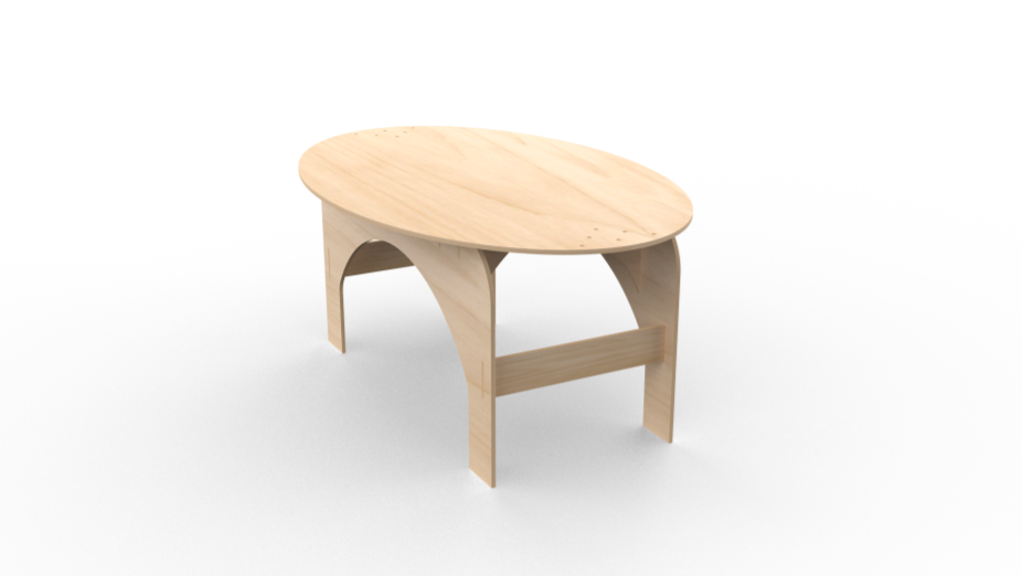
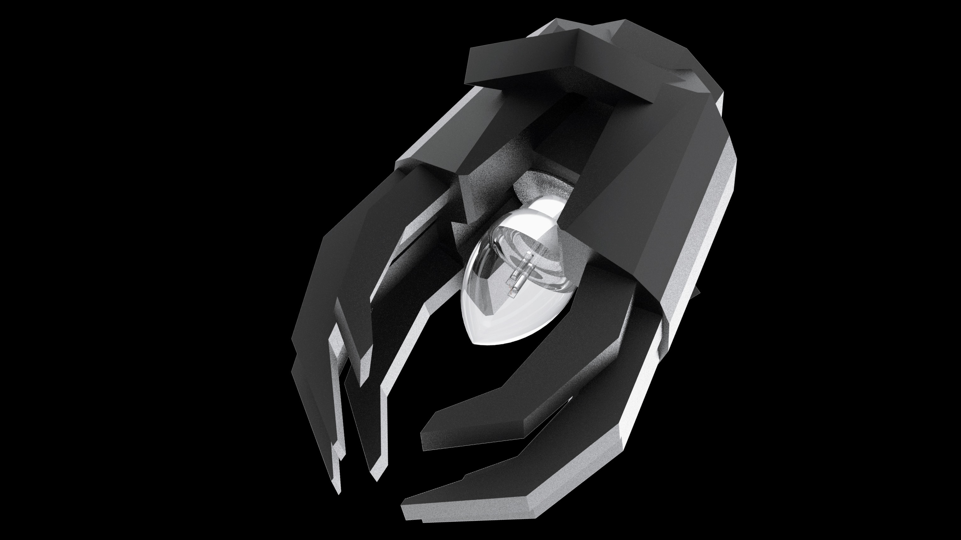
At the beginning of the spring term, I was tasked with creating a functional and aesthetic store in an unused radio room. Between me and 10 other classmates, we were able to create a store front that both my class and design heads were proud to present. The grand opening took place on June 6 2023 in our technology building.
The space
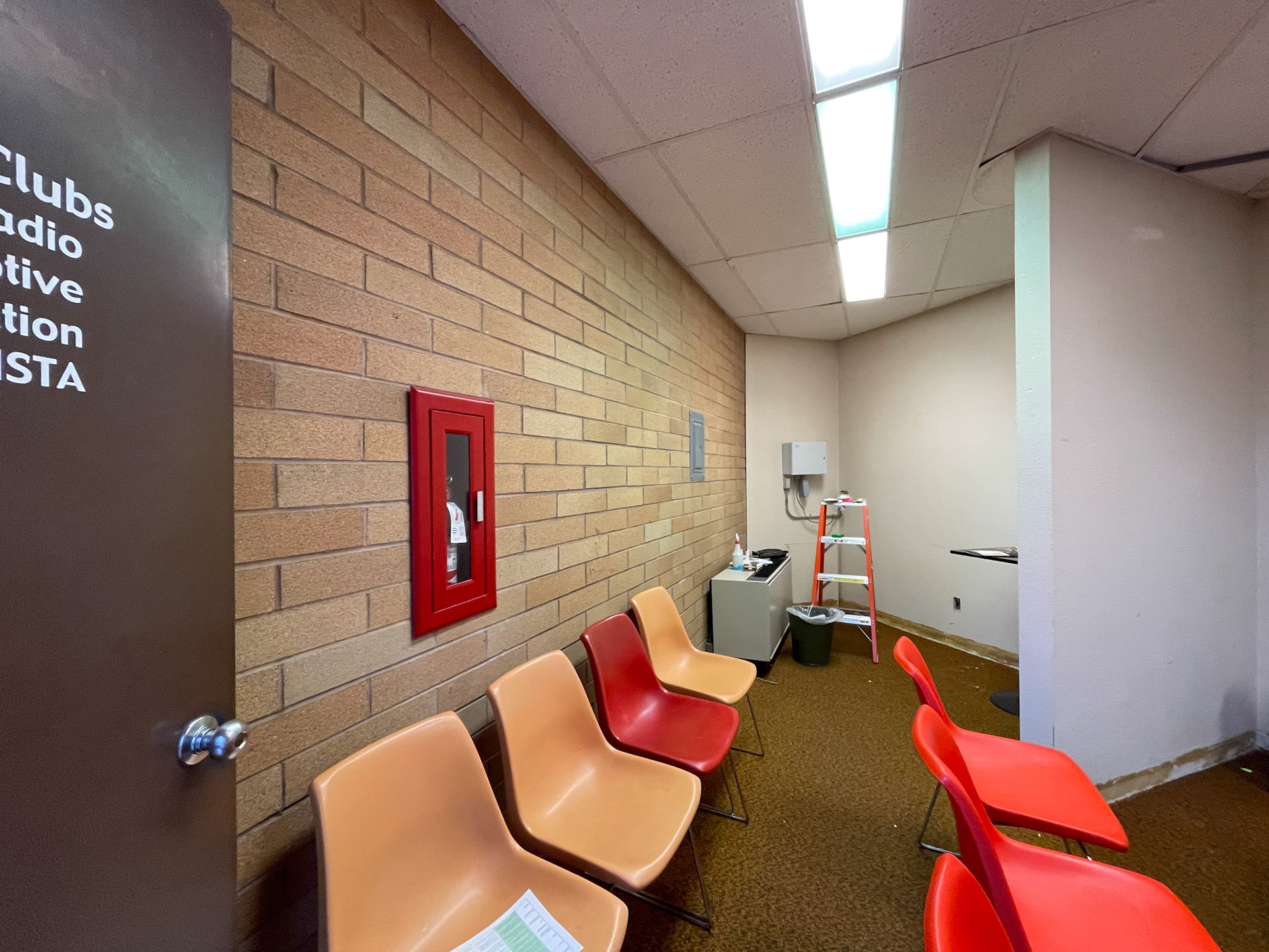
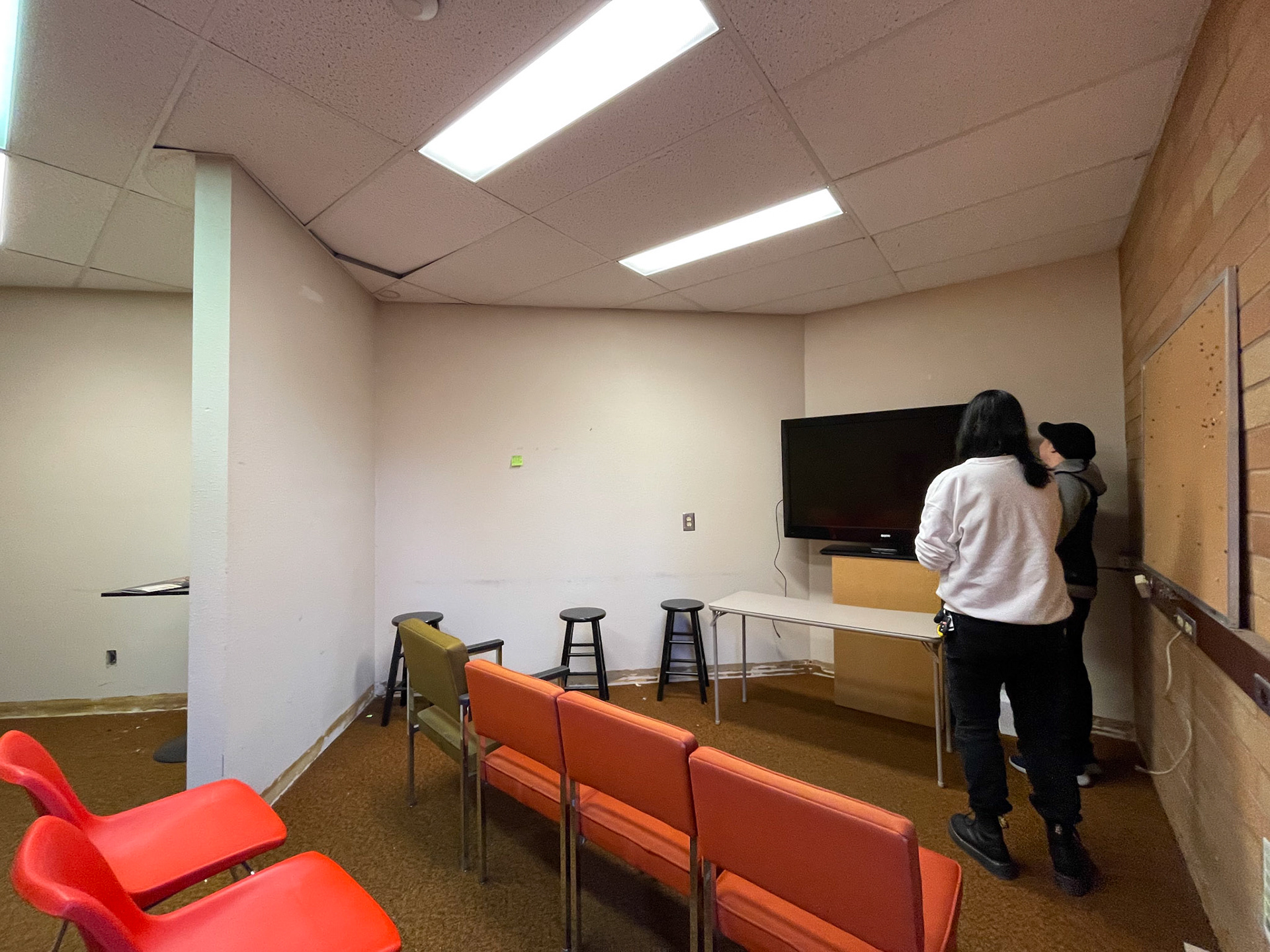
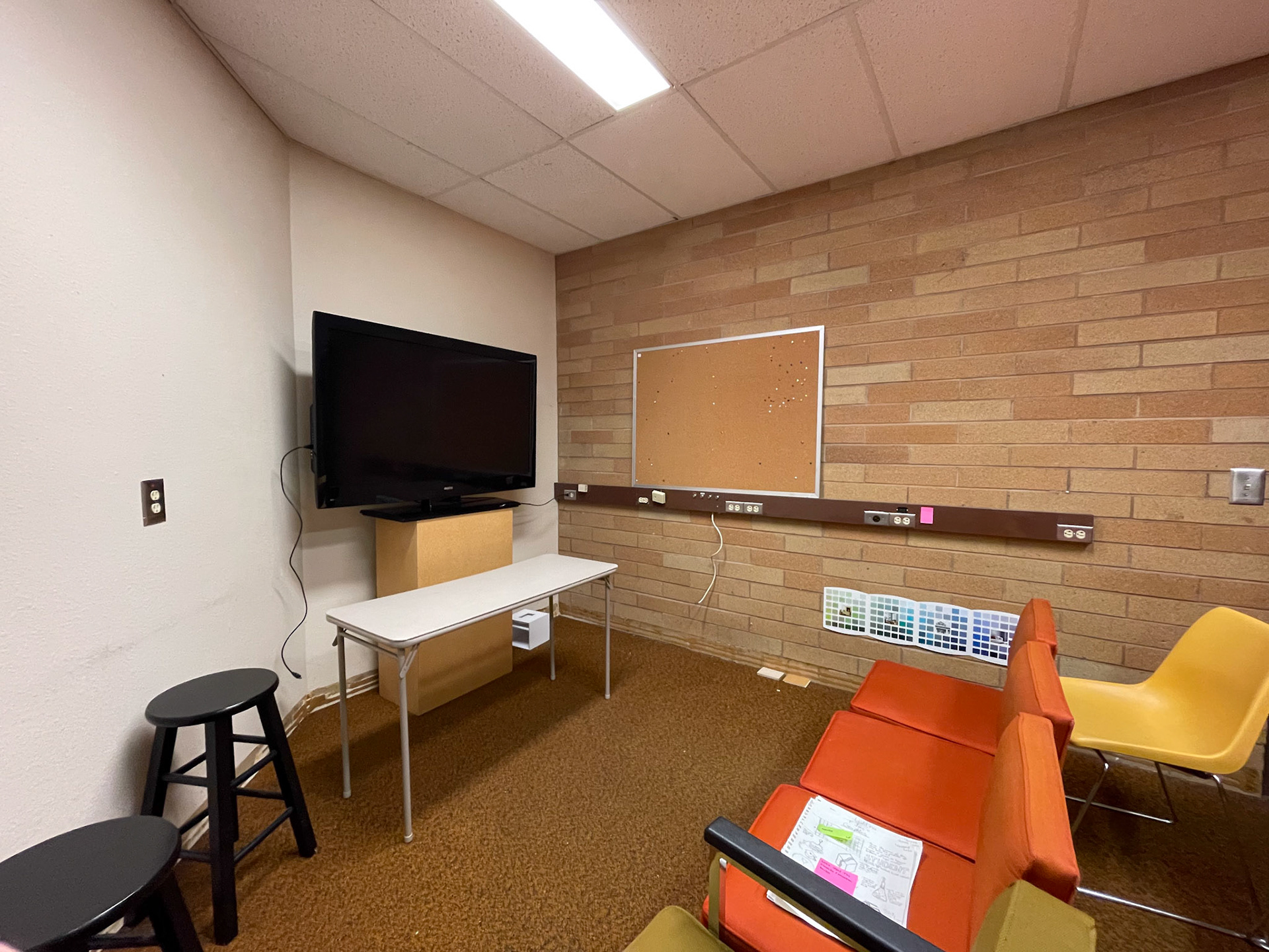
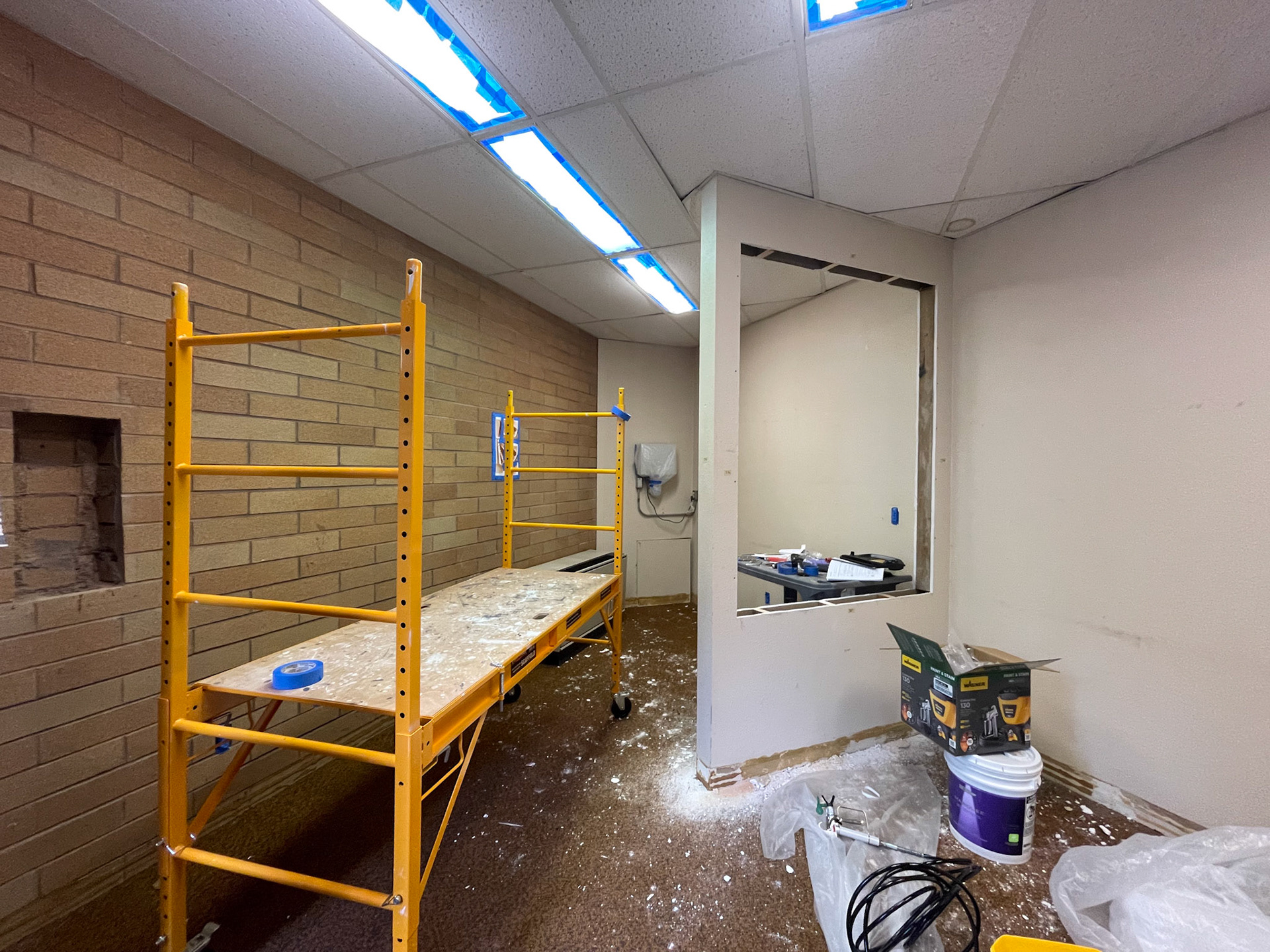
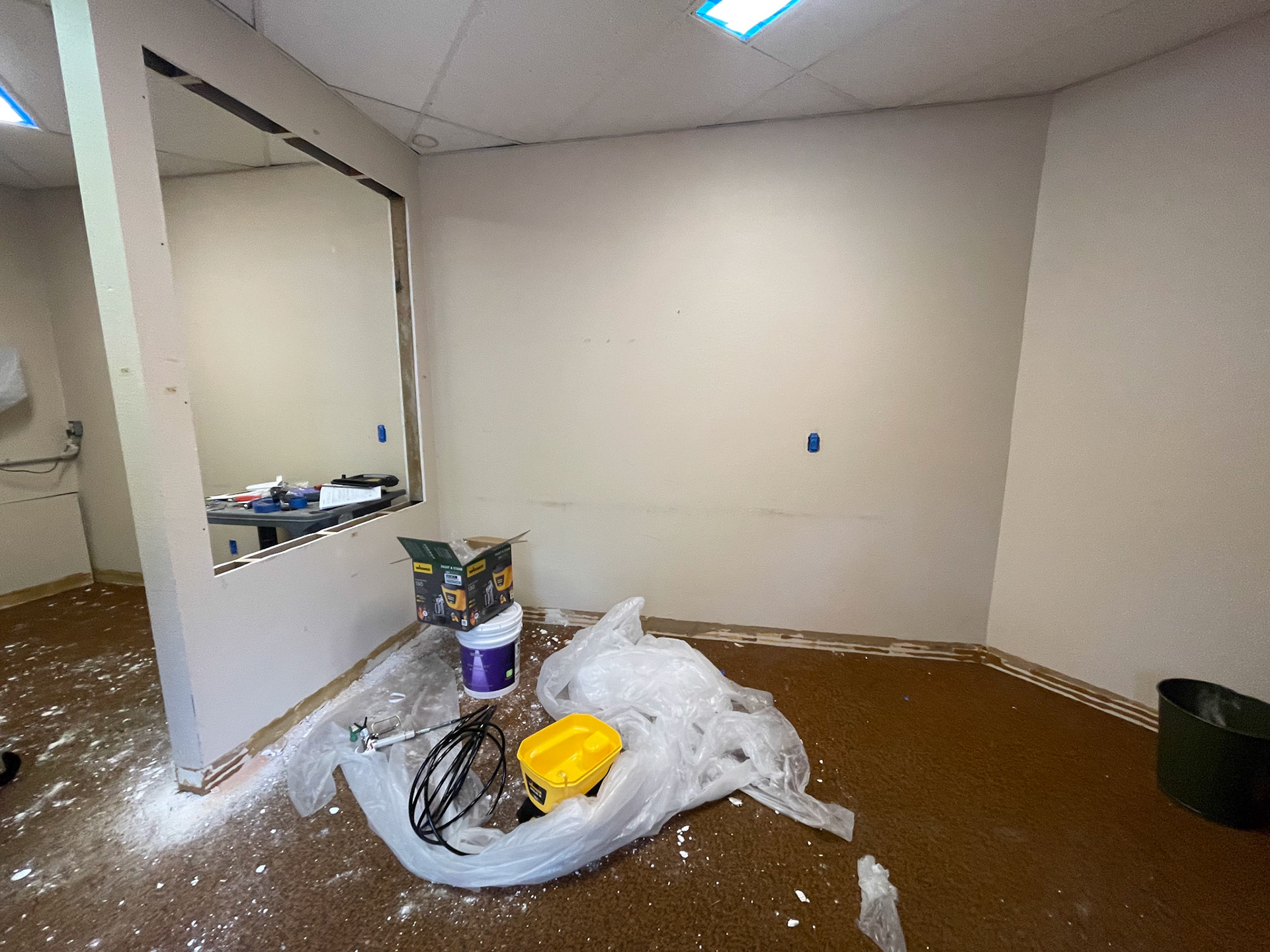
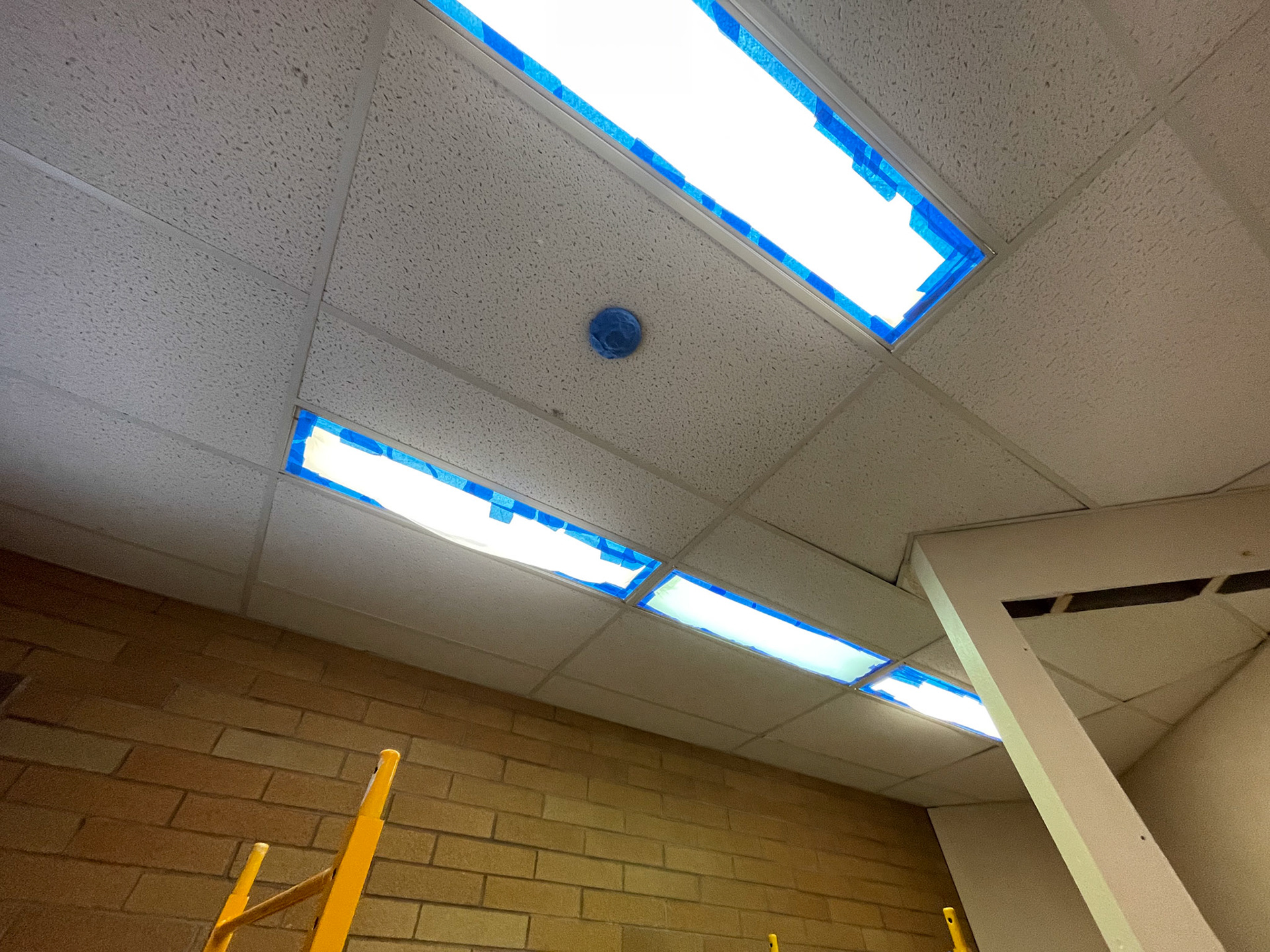
The room we would be working in was both dated and underutilized. we brought in chairs and a tv to discuss ideas in the space. However, doing so showed just how awkward the space really was. the whites of the ceiling tiles and walls clashed, the brick was an unsavory reddish-brown, the lighting was harsh, and the carpet was just unattractive. There were some aspects of the room shape we could change (namely the wall in the midsection), but everything else relied on what could be added into the space.
inspiration
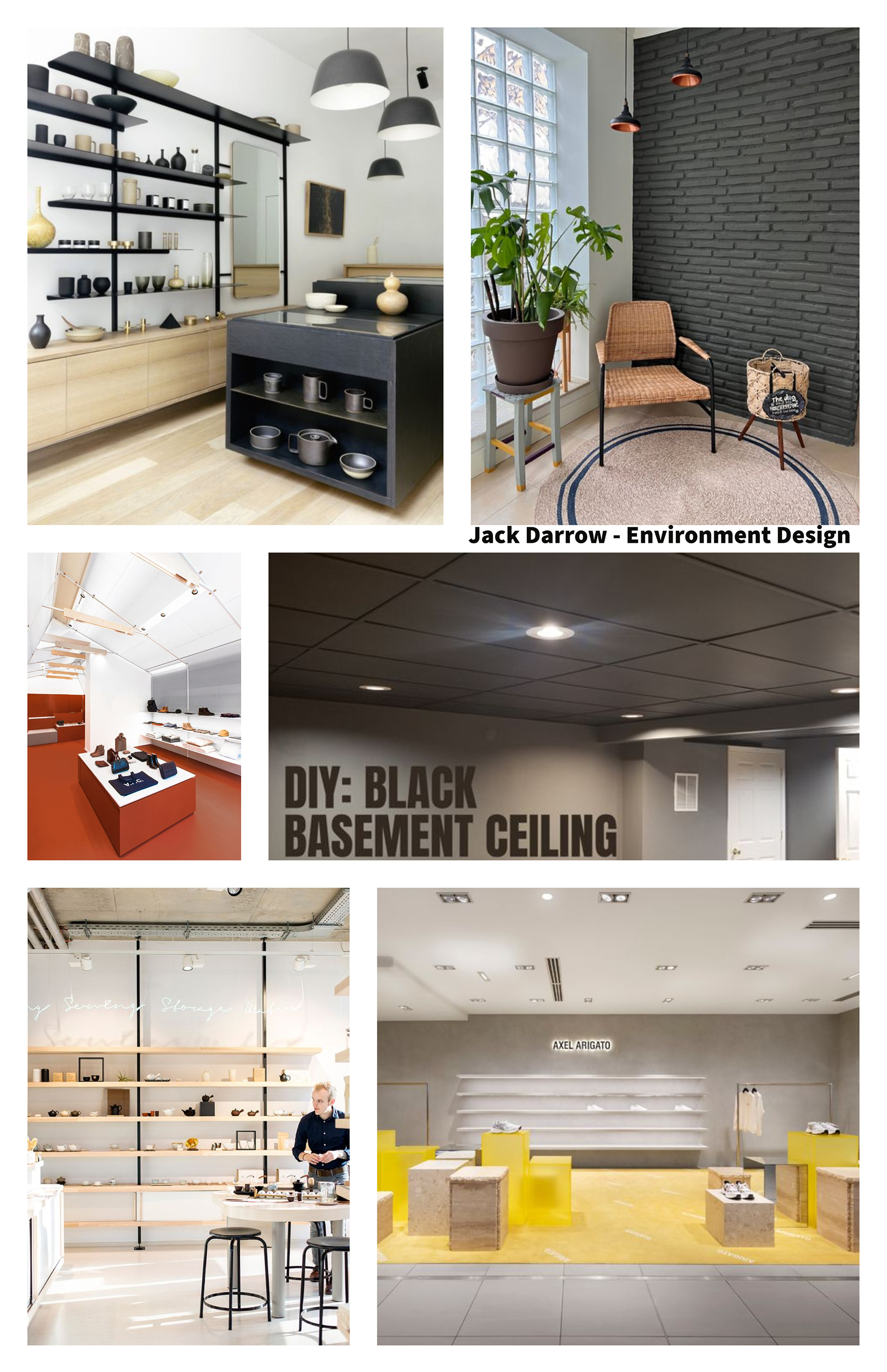
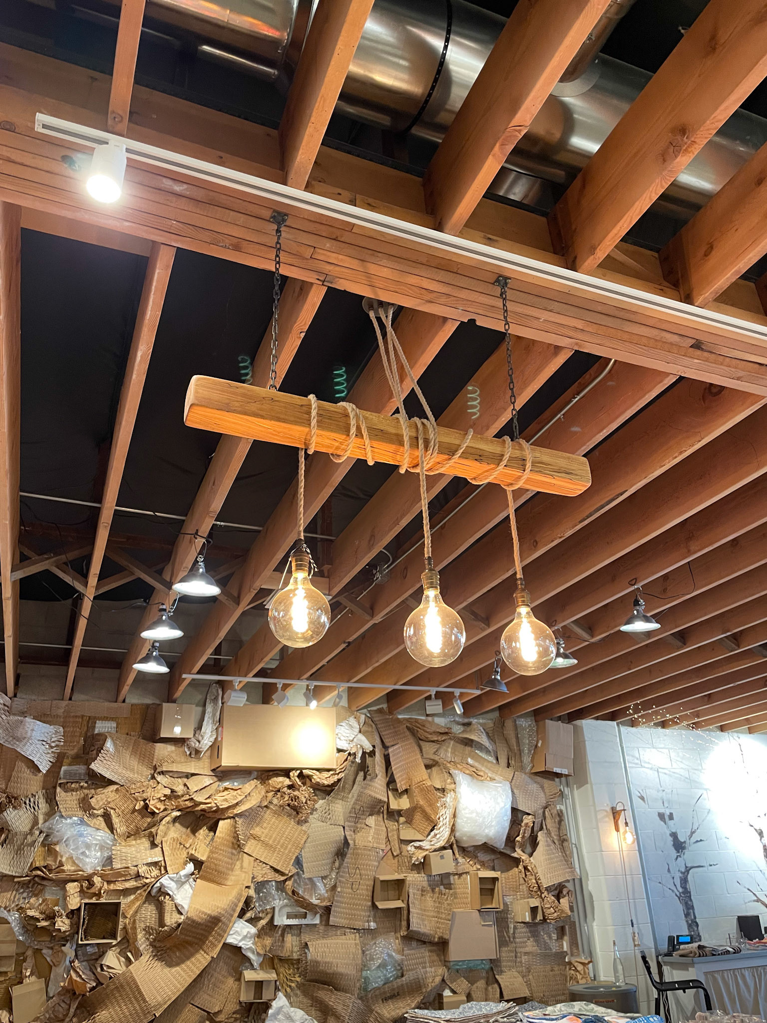
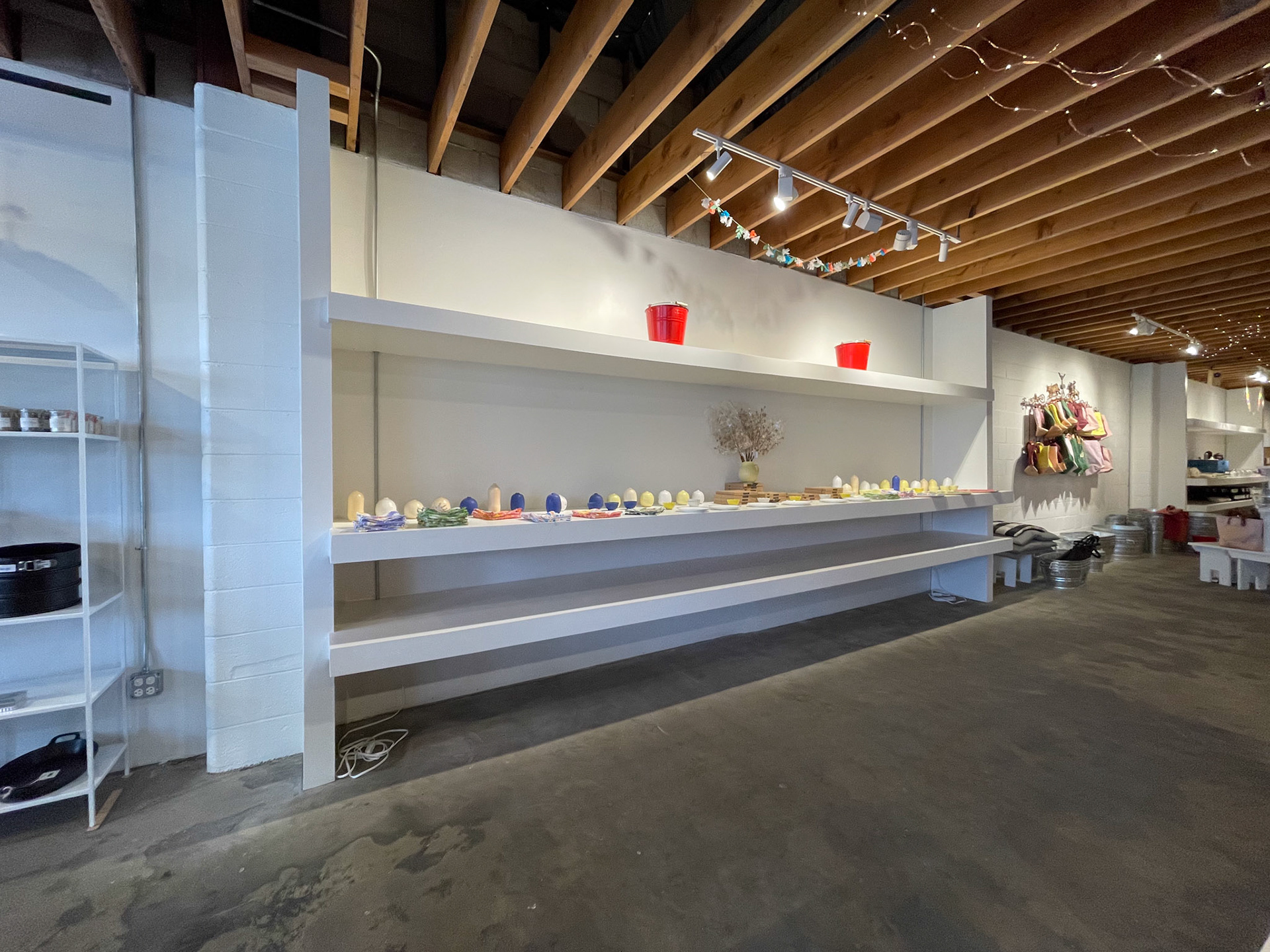
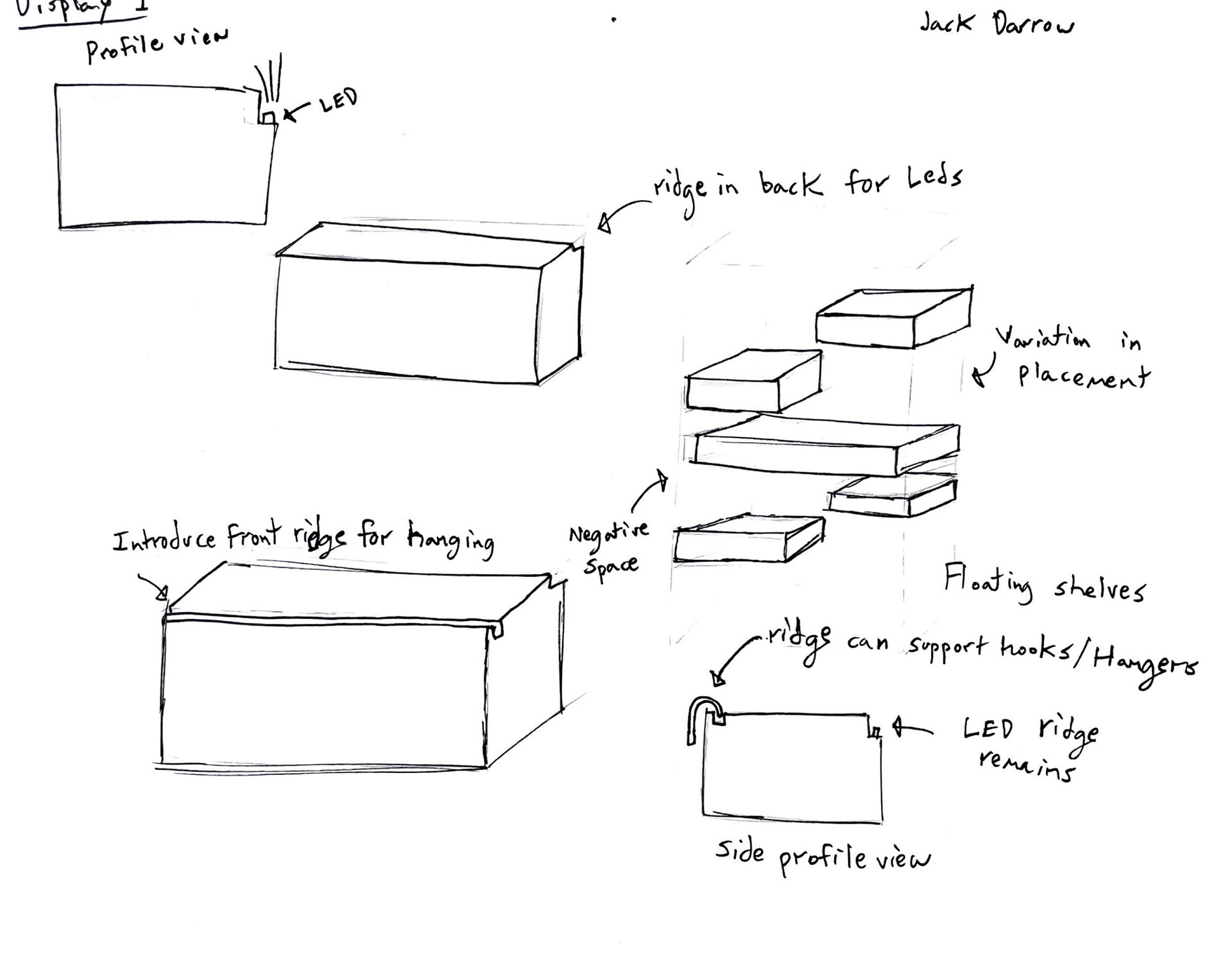
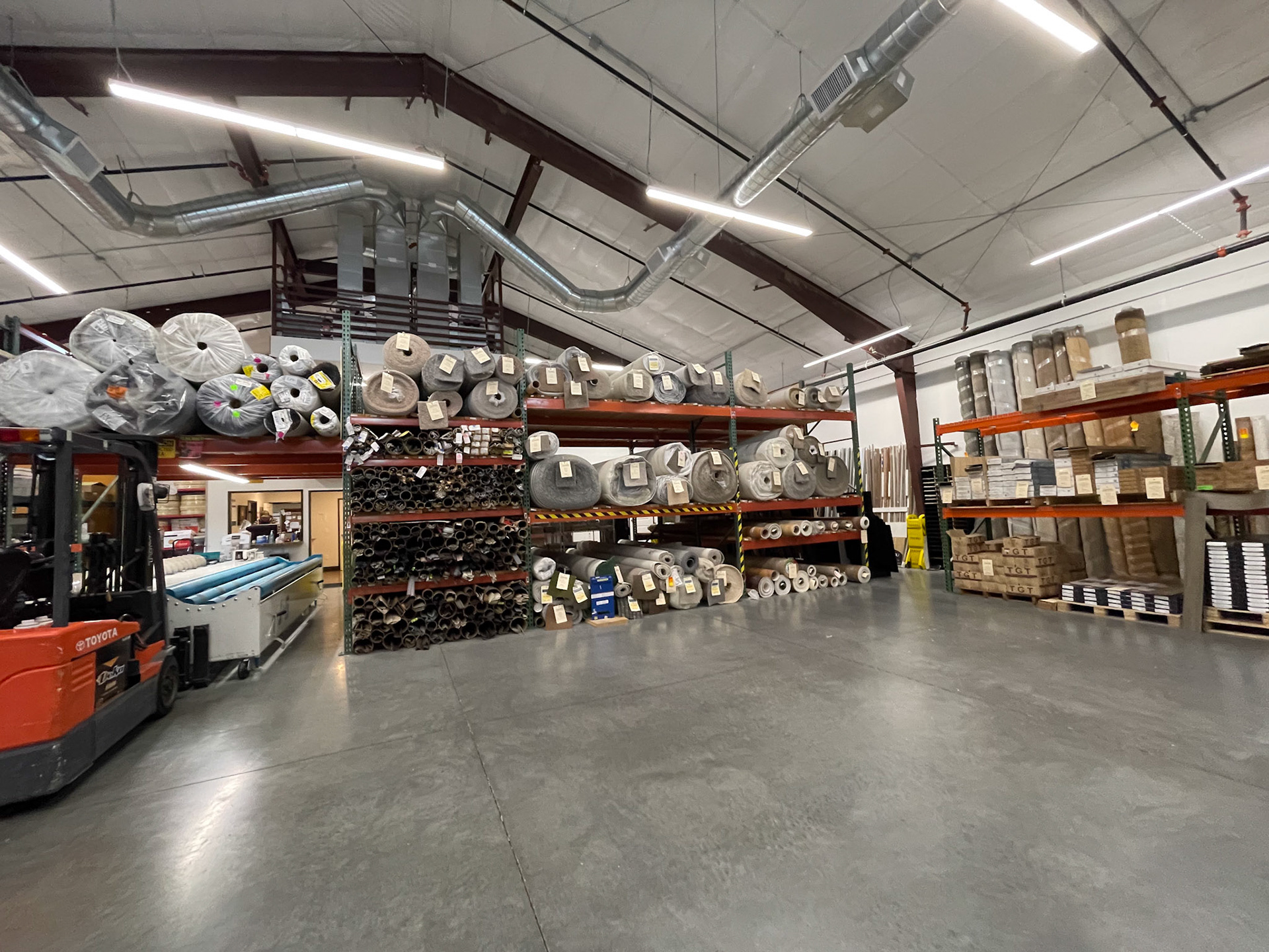
The main goal for the space was a store with neutral colors, simple shapes, and honesty in materials. From there, we each created our own mood boards exploring the premises presented. I tried to choose images with additive lighting and simple shelving. Floating or loose shelving was very intriguing to me, so a lot of my inspiration pics had iterations of simple shelving. We took a quick field trip to a local home goods store that had a similar vibe to the design language we were shooting for. While it was a bit more industrial than what we had envisioned, it still provided a lot of lighting and shelving examples to analyze.


Sketch concepts
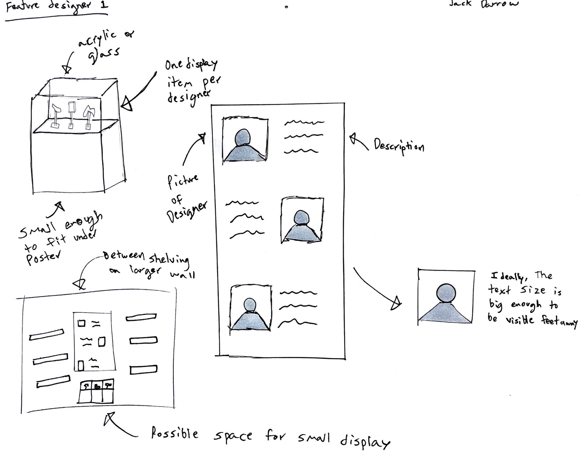
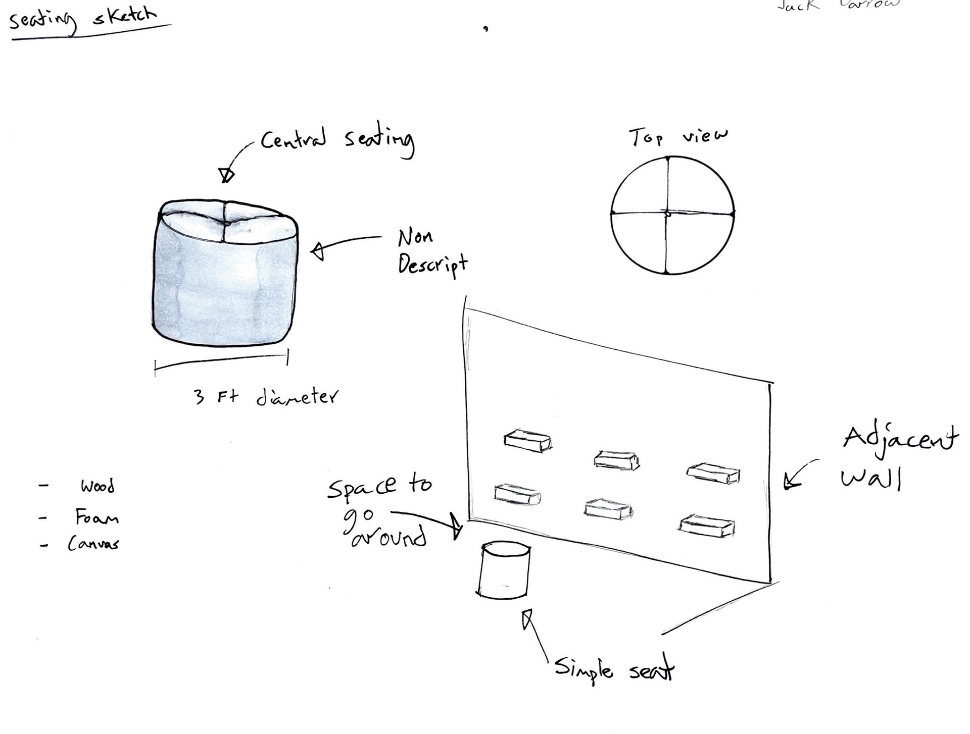
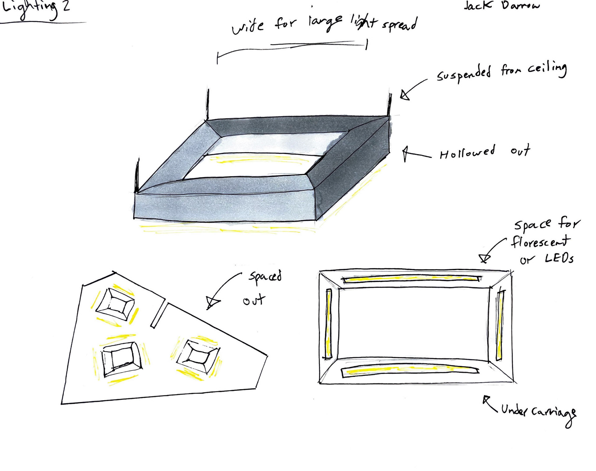
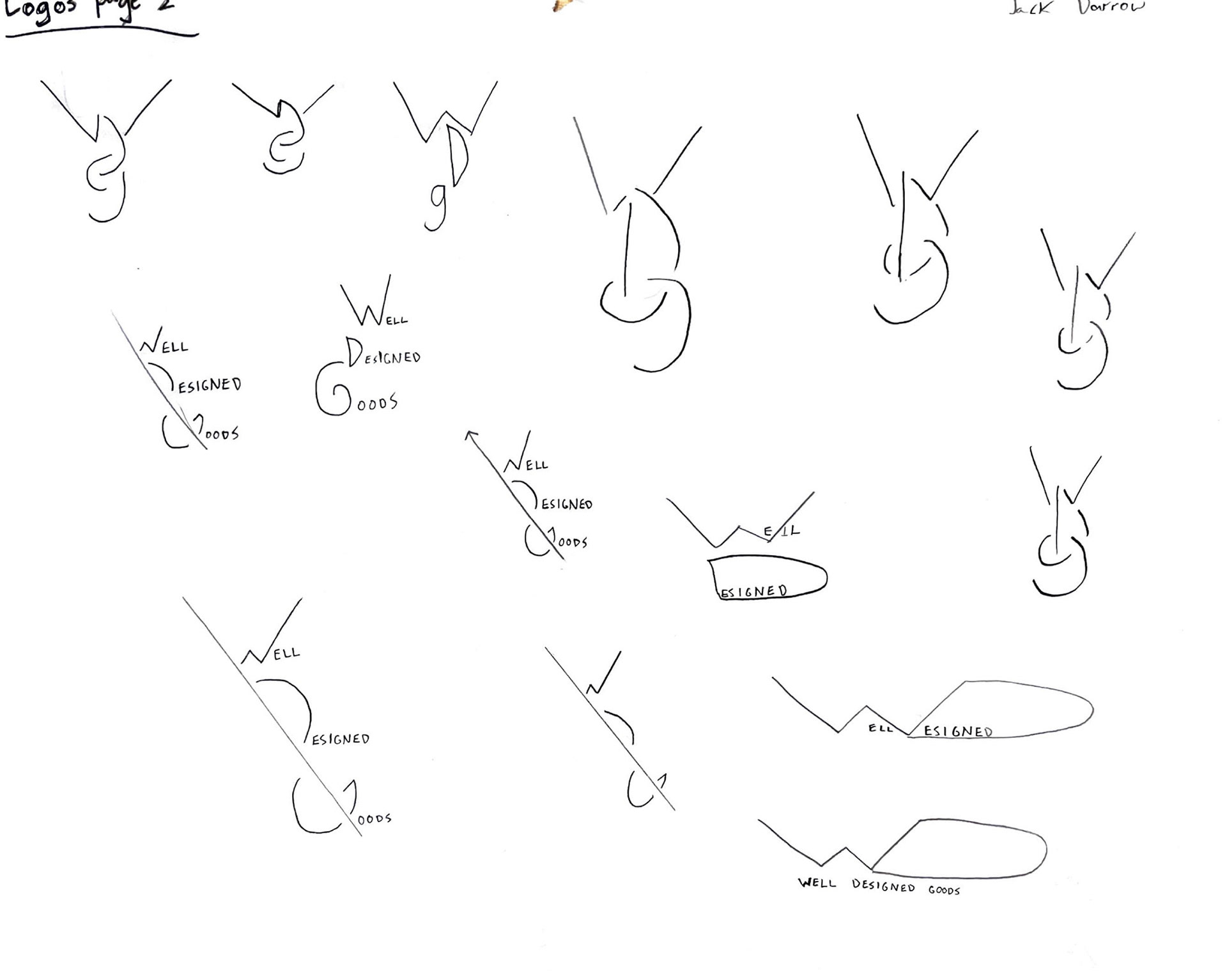
We were told to explore different concepts via sketch and iteration. Our group discussion included aspects like a featured designer, shelving, lighting, logos, and a possible centerpiece. my biggest emphasis surrounded loose shelving and atmospheric lighting. The combination of all of our sketches produced good building blocks for more refined concepts.
Exploration of concepts
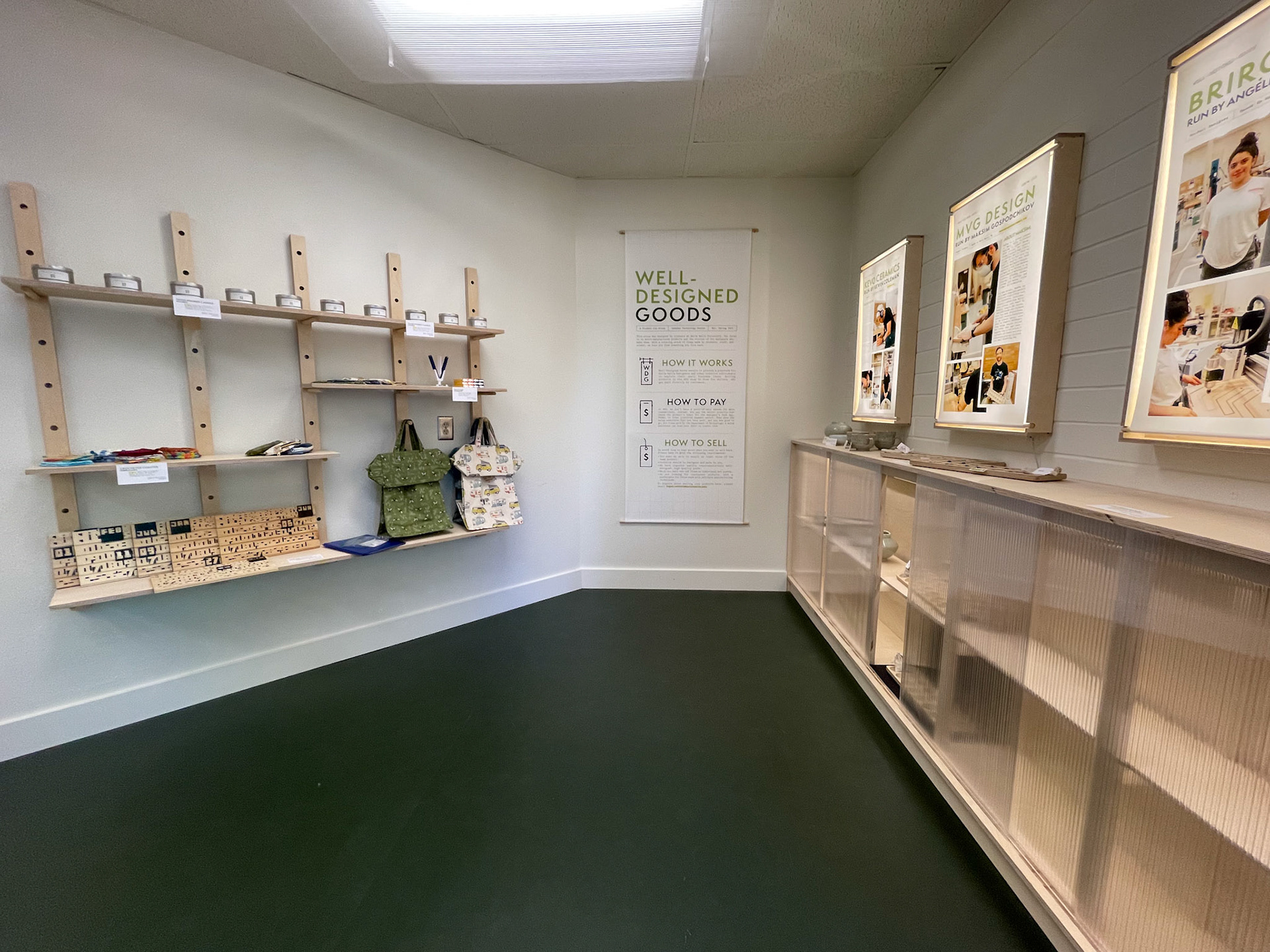
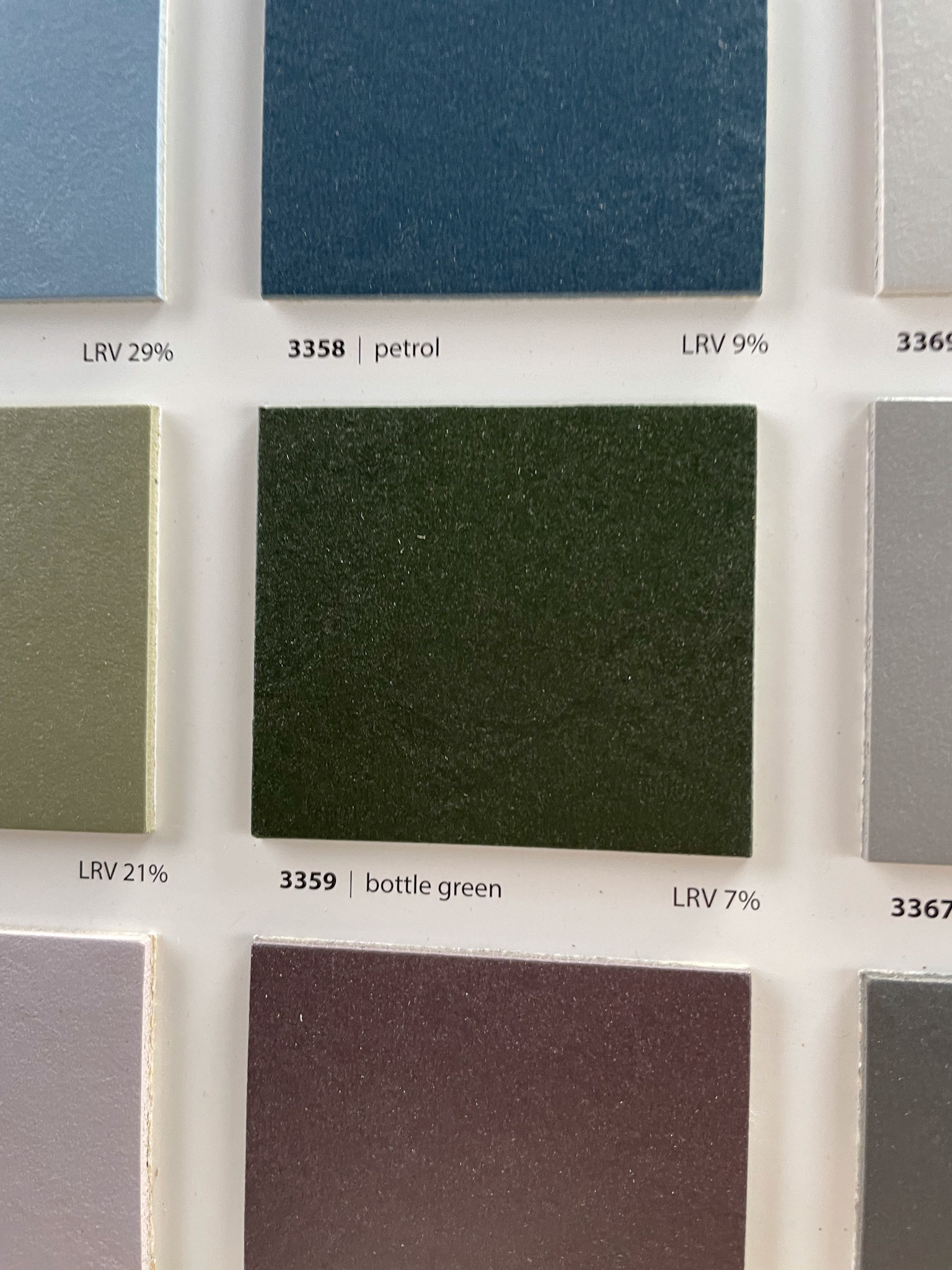
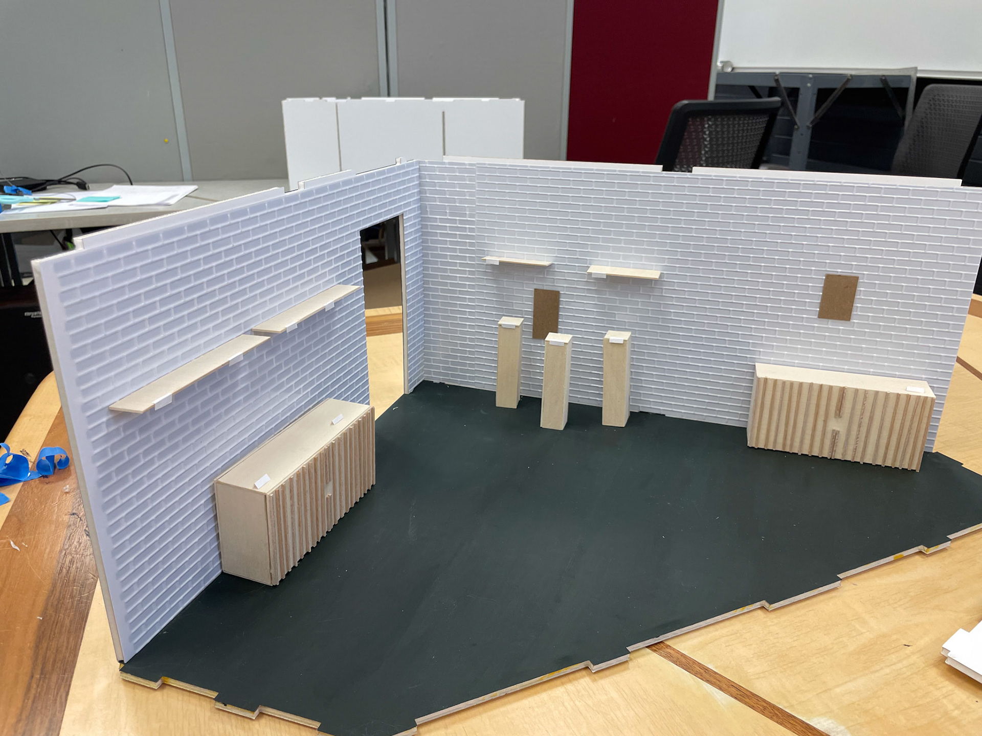
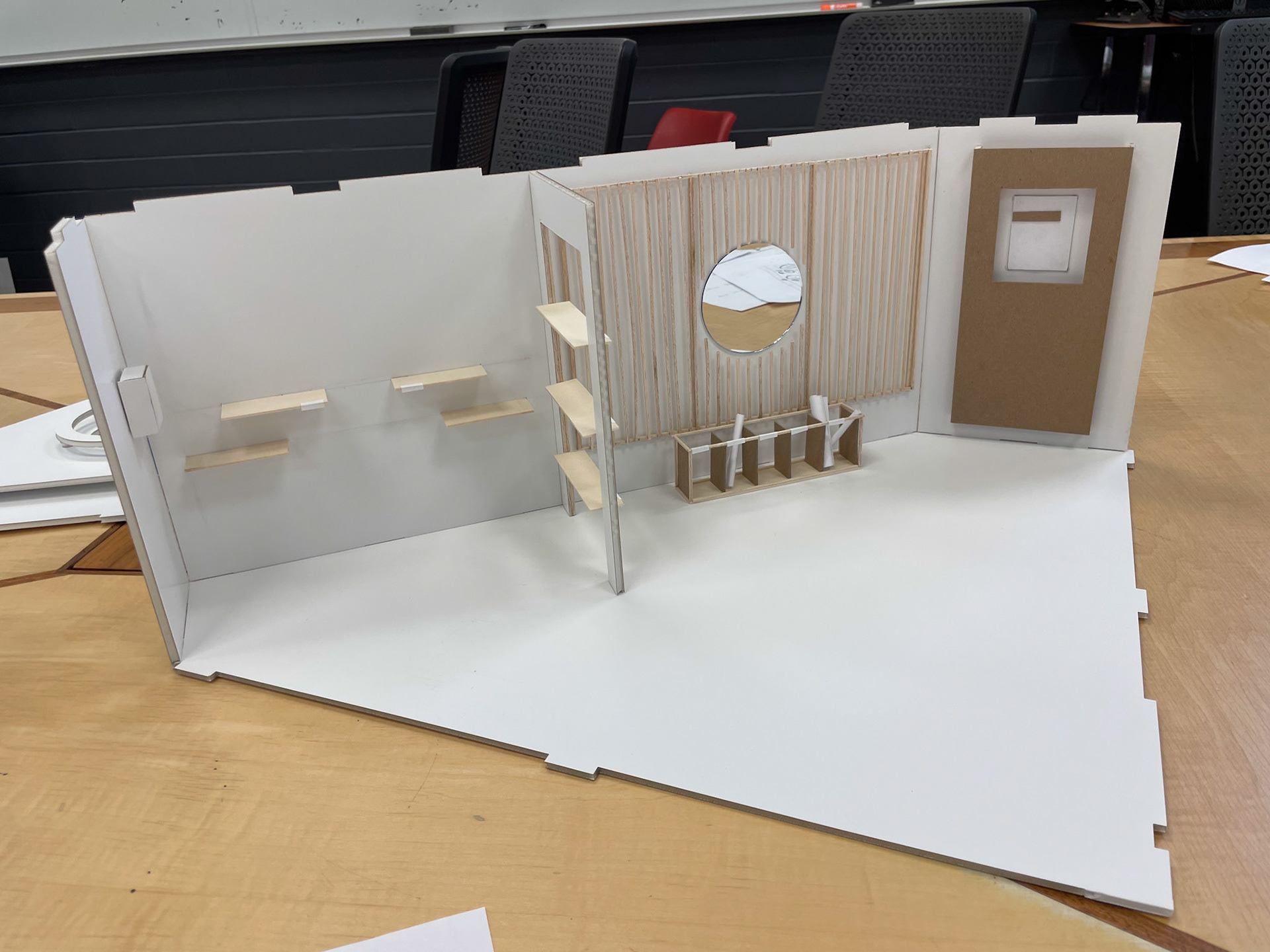
The class was divided into smaller groups and tasked with creating a comprehensive pitch for the store. My group looked into flooring, as that would be the biggest external cost. While we did have a relative budget, it could be expanded if the department approved the purchase. We found a remnant roll of dark green linoleum that could be acquired for a deep discount. We decided to include that in our physical model, since it was very plausible it could be integrated. A theme that got introduced heavily in our model was slats, as seen on the cabinets and accent wall. we included some floating shelves, a cork board, and display pedestals. additionally, we decided that opening up the wall in the mid-section could make the space feel more open, so our model showcased the wall being hollowed out with additional shelving. The most ambitious concept we explored was an additional ceiling piece that could diffuse the light from the actual ceiling.
Renovation
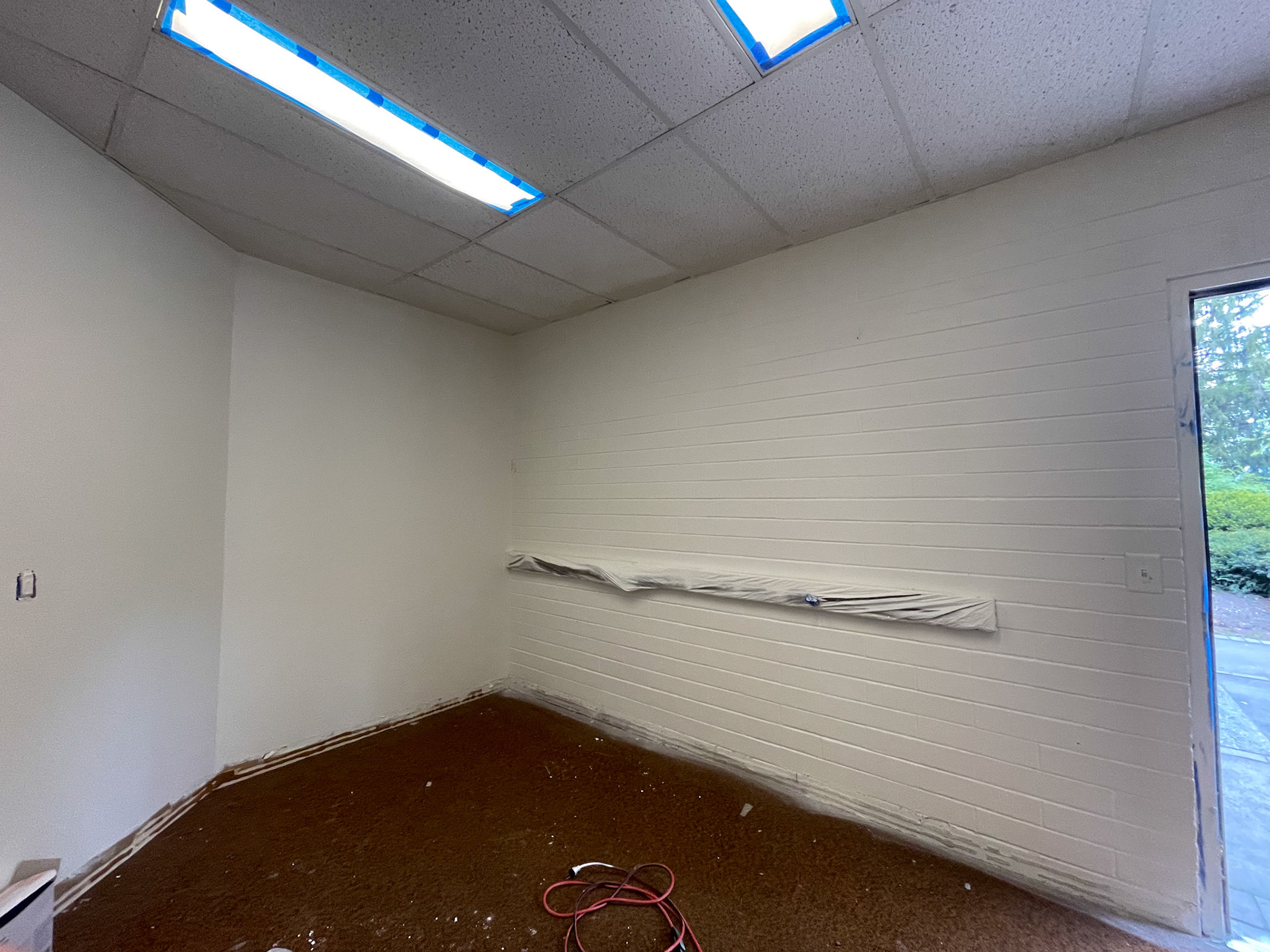
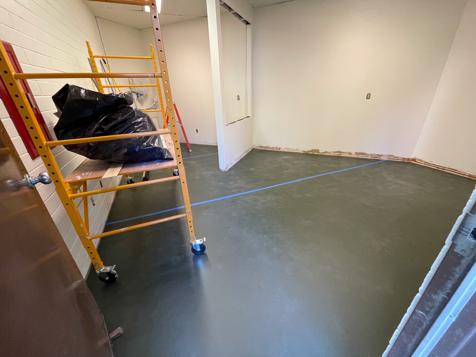
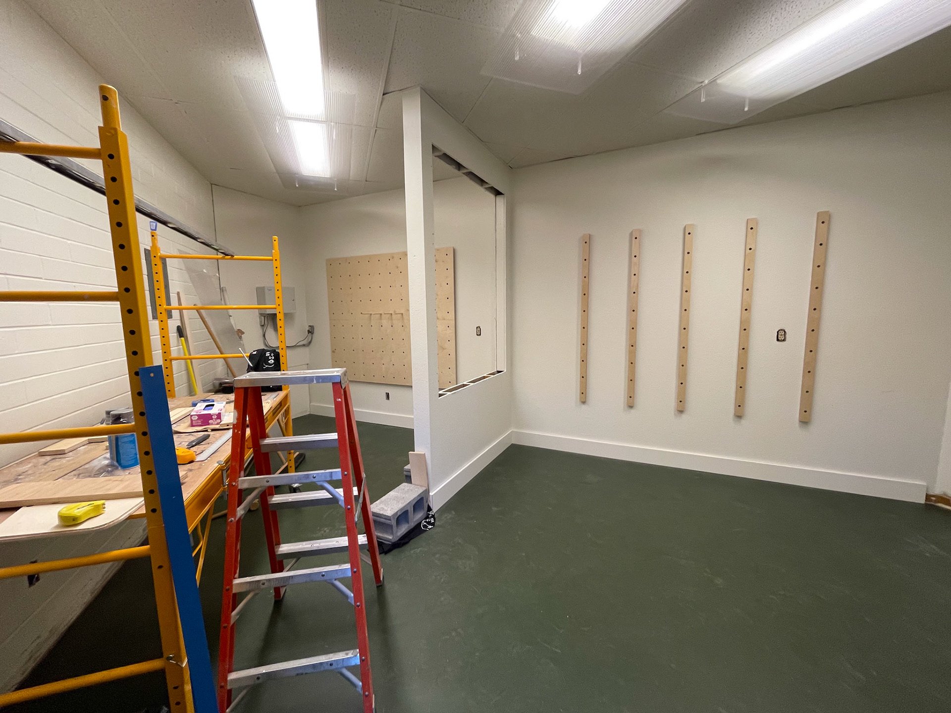
Every sub-group had valid contributions with their pitches, with many ideas either being similar to ours or chosen to be combined with other attributes. The room got taped off, the hole was cut into the wall, and painting had begun. after the room could be fully painted, the carpet could then be removed. After those initial modifications, we could start applying the concepts we had agreed upon.
project 1 - Designer display
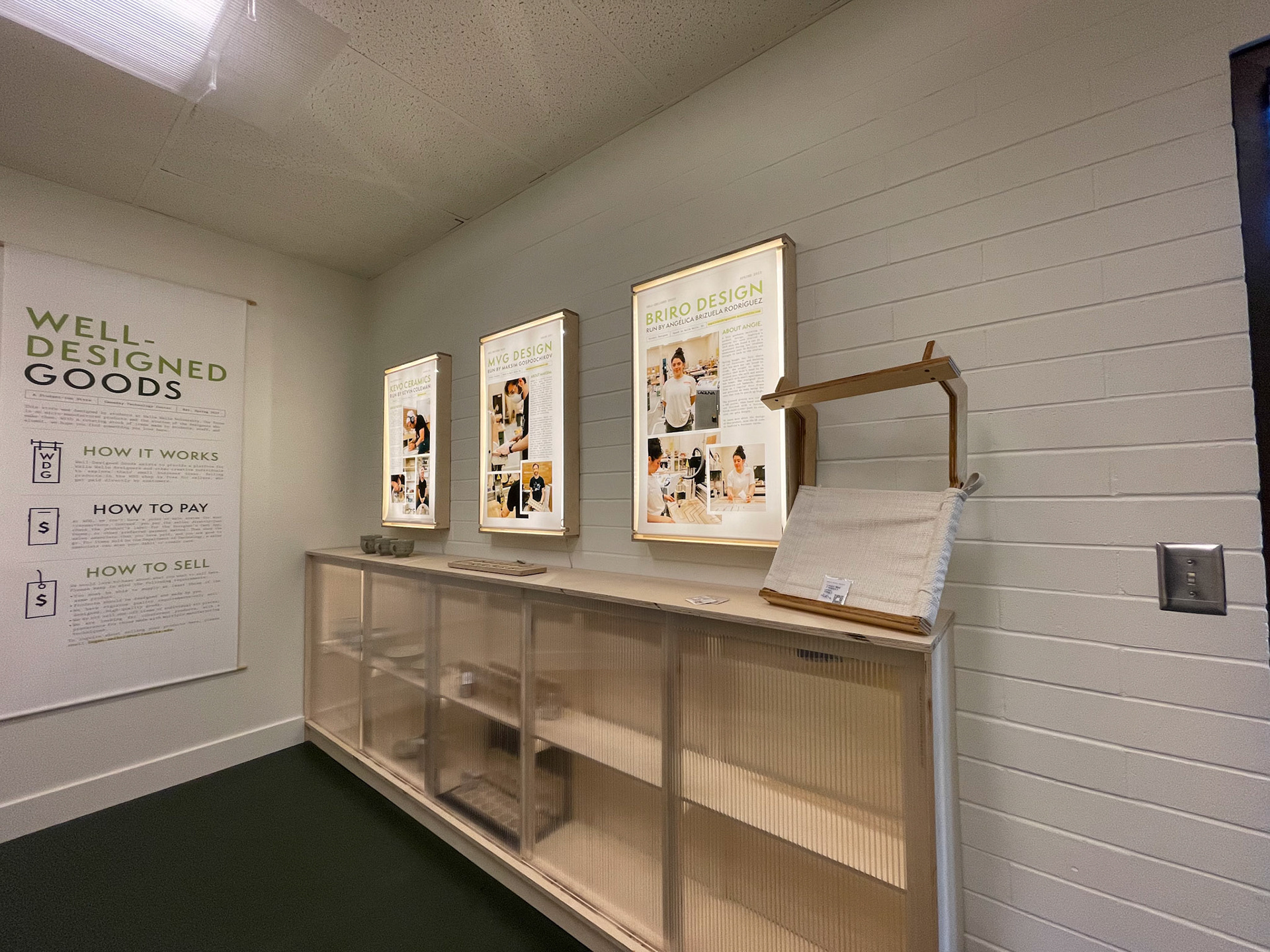
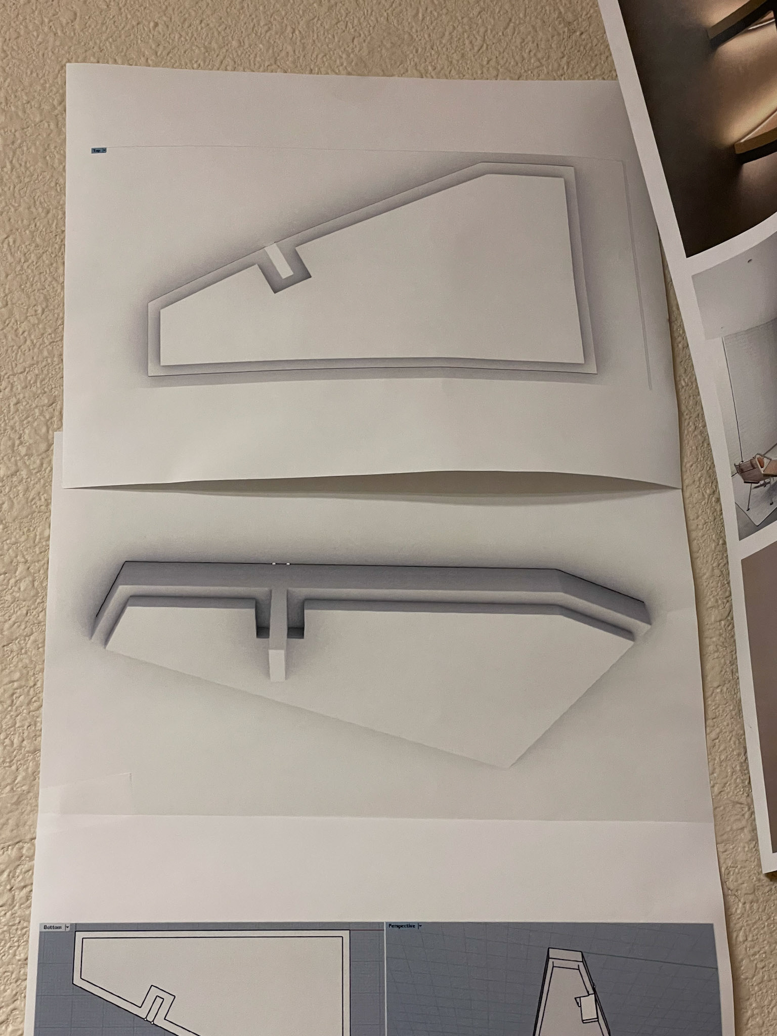
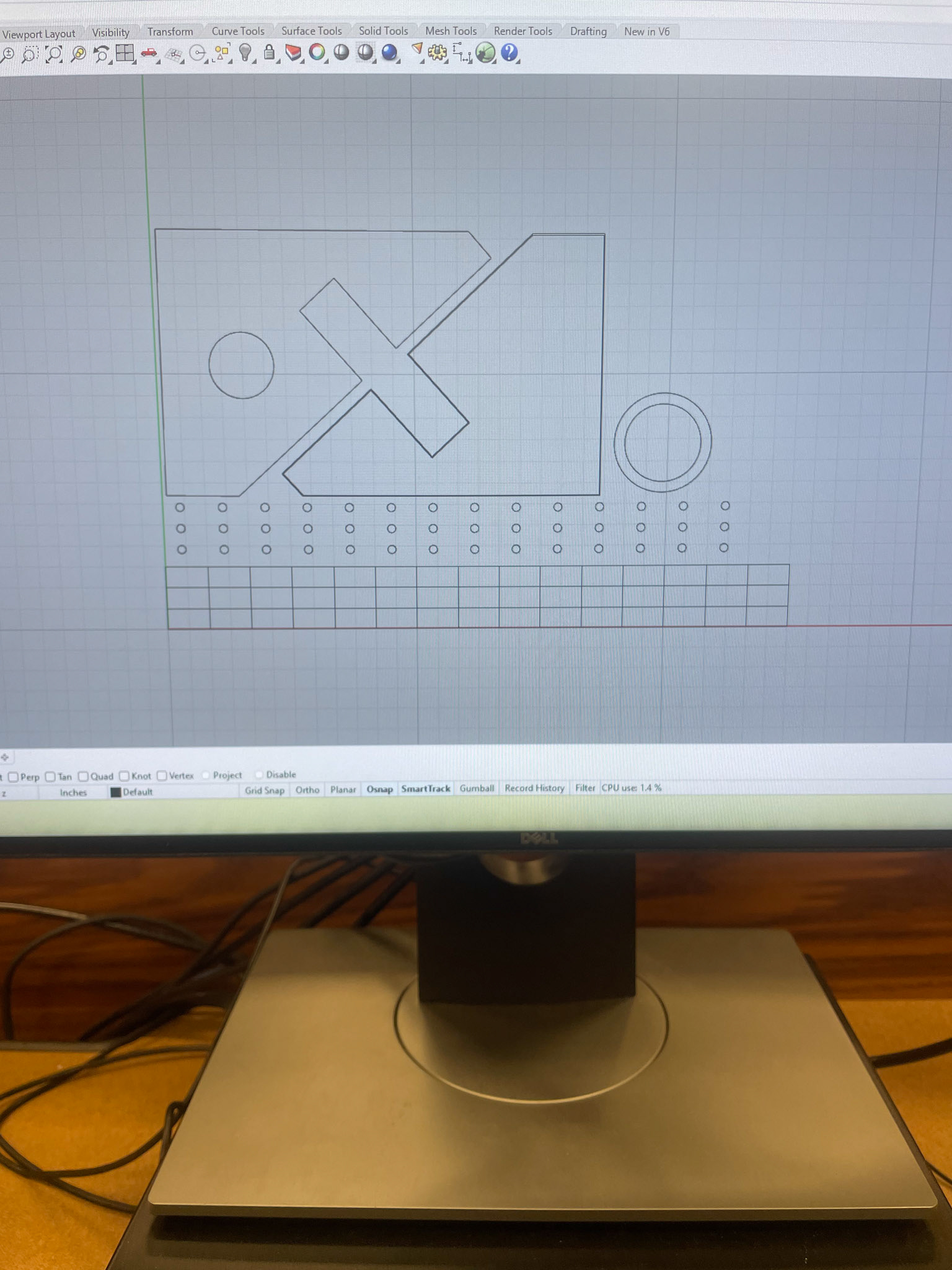
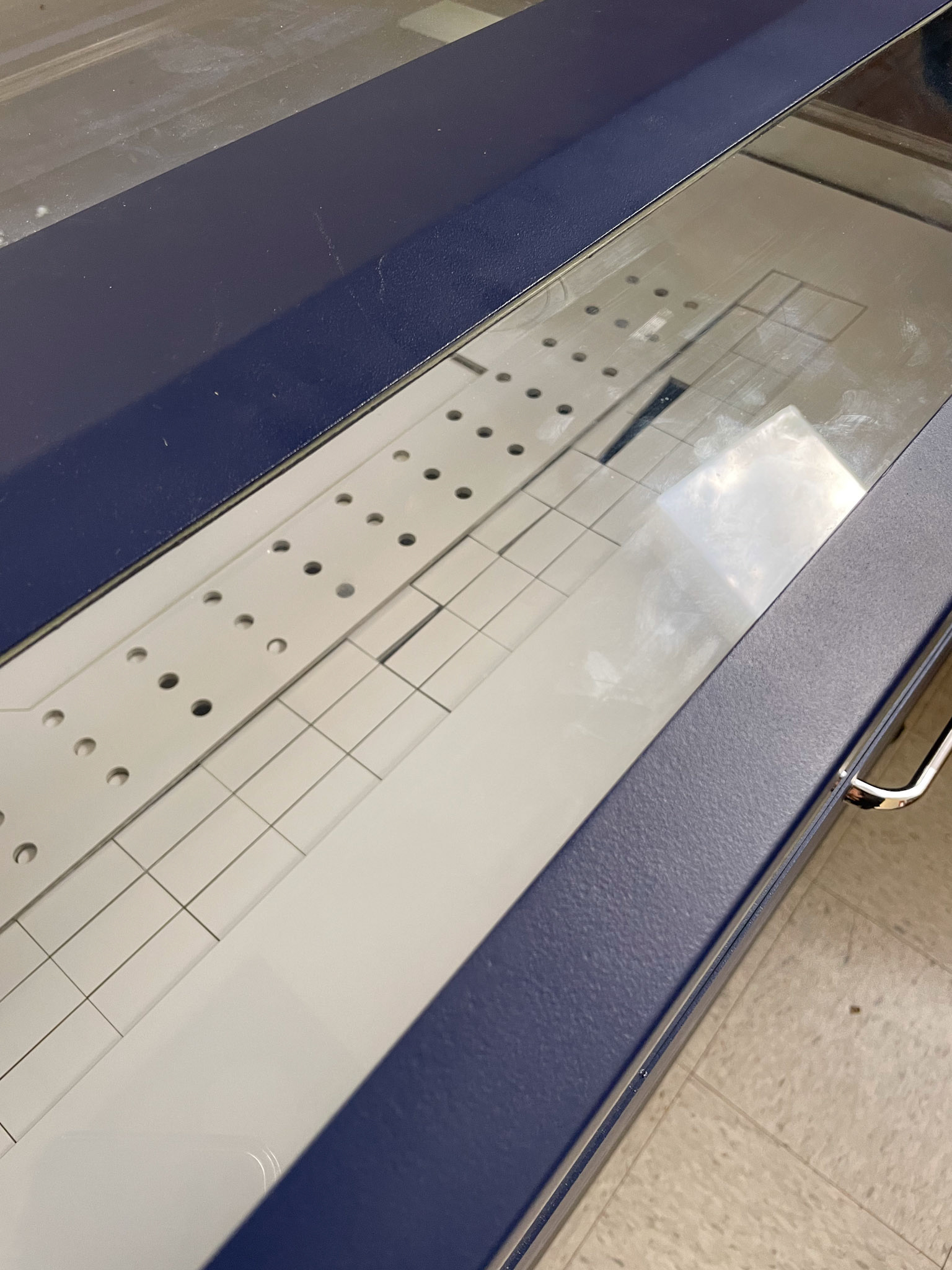
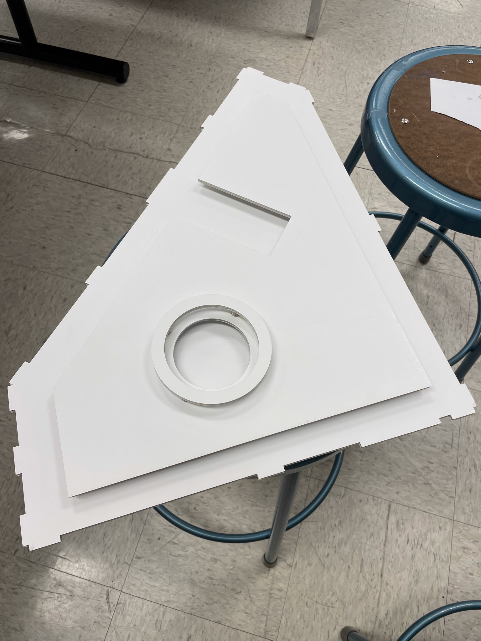
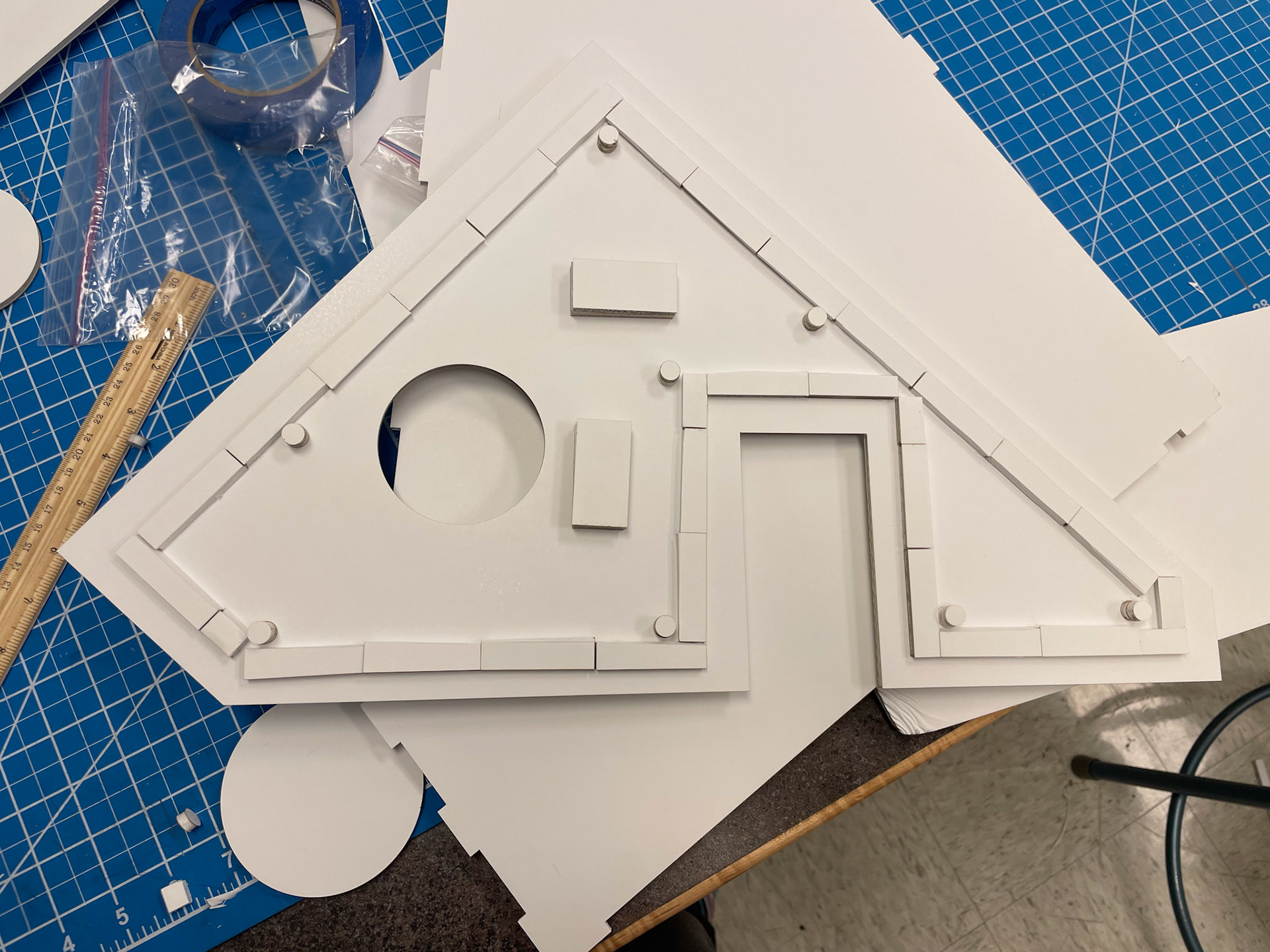
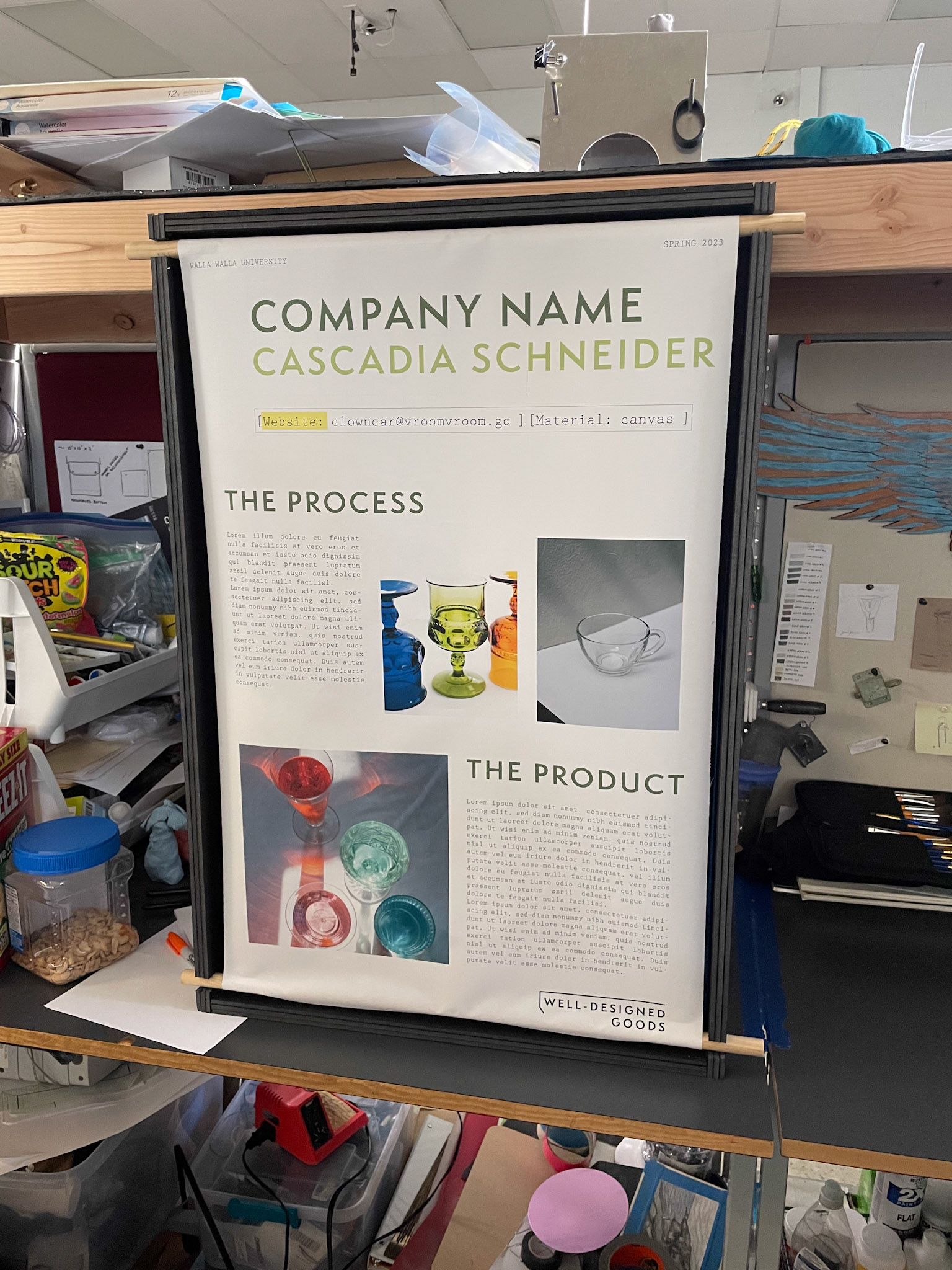
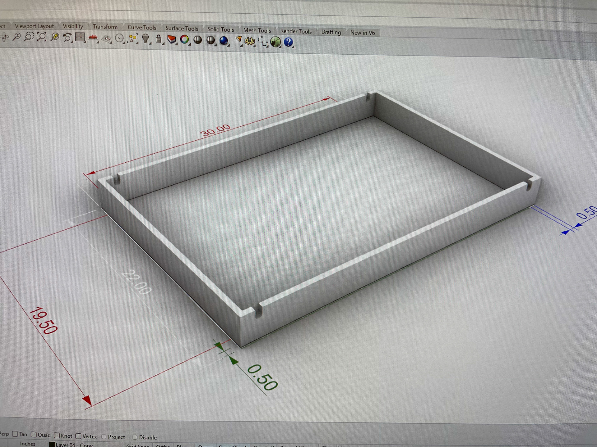
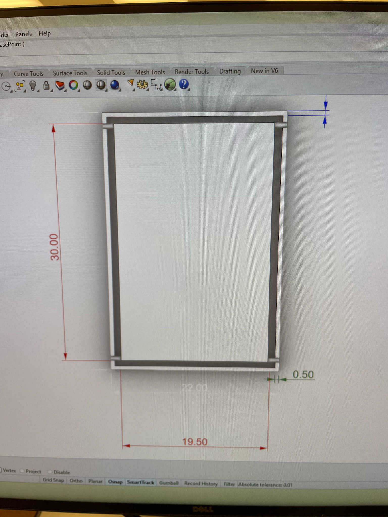
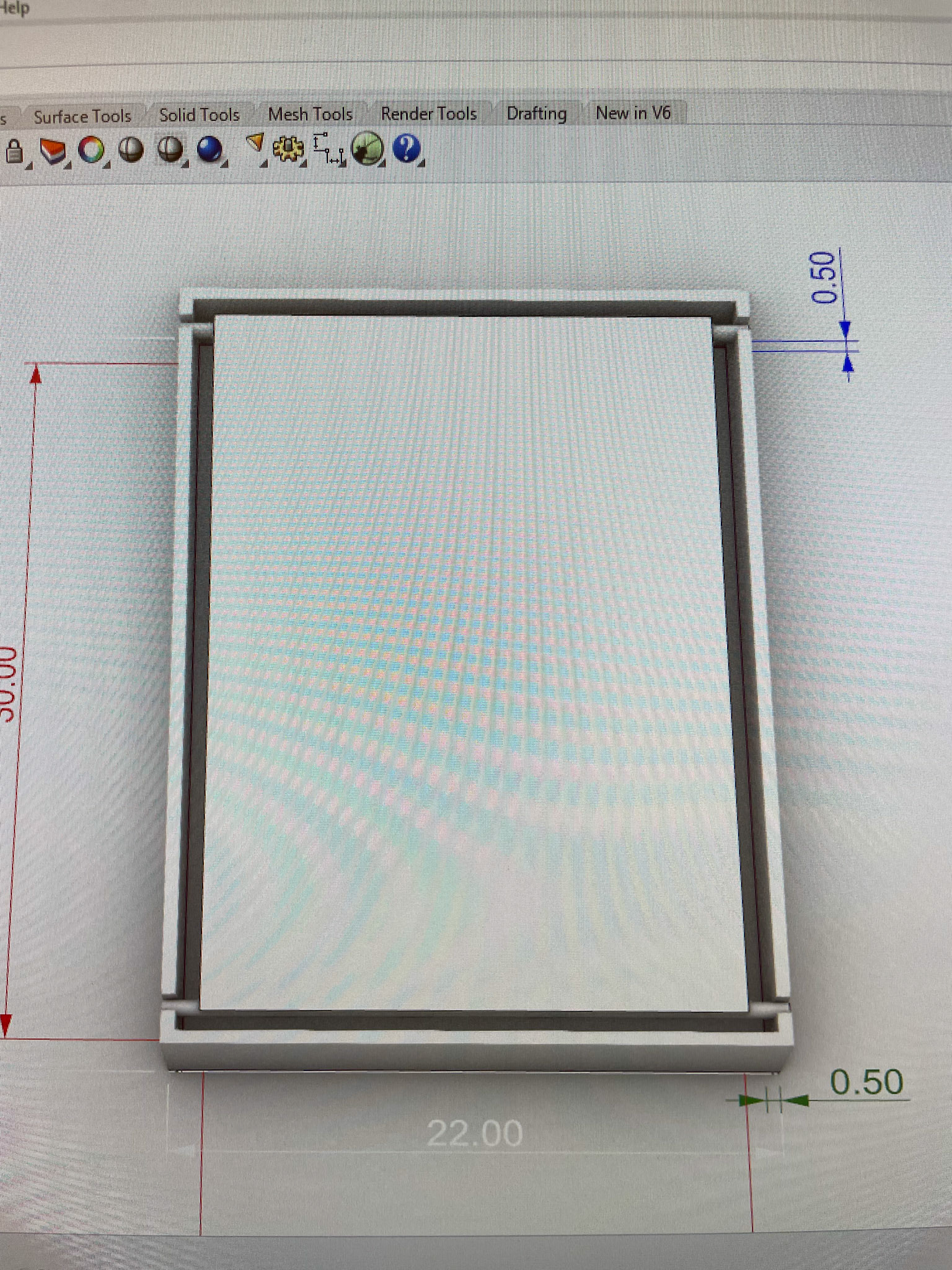
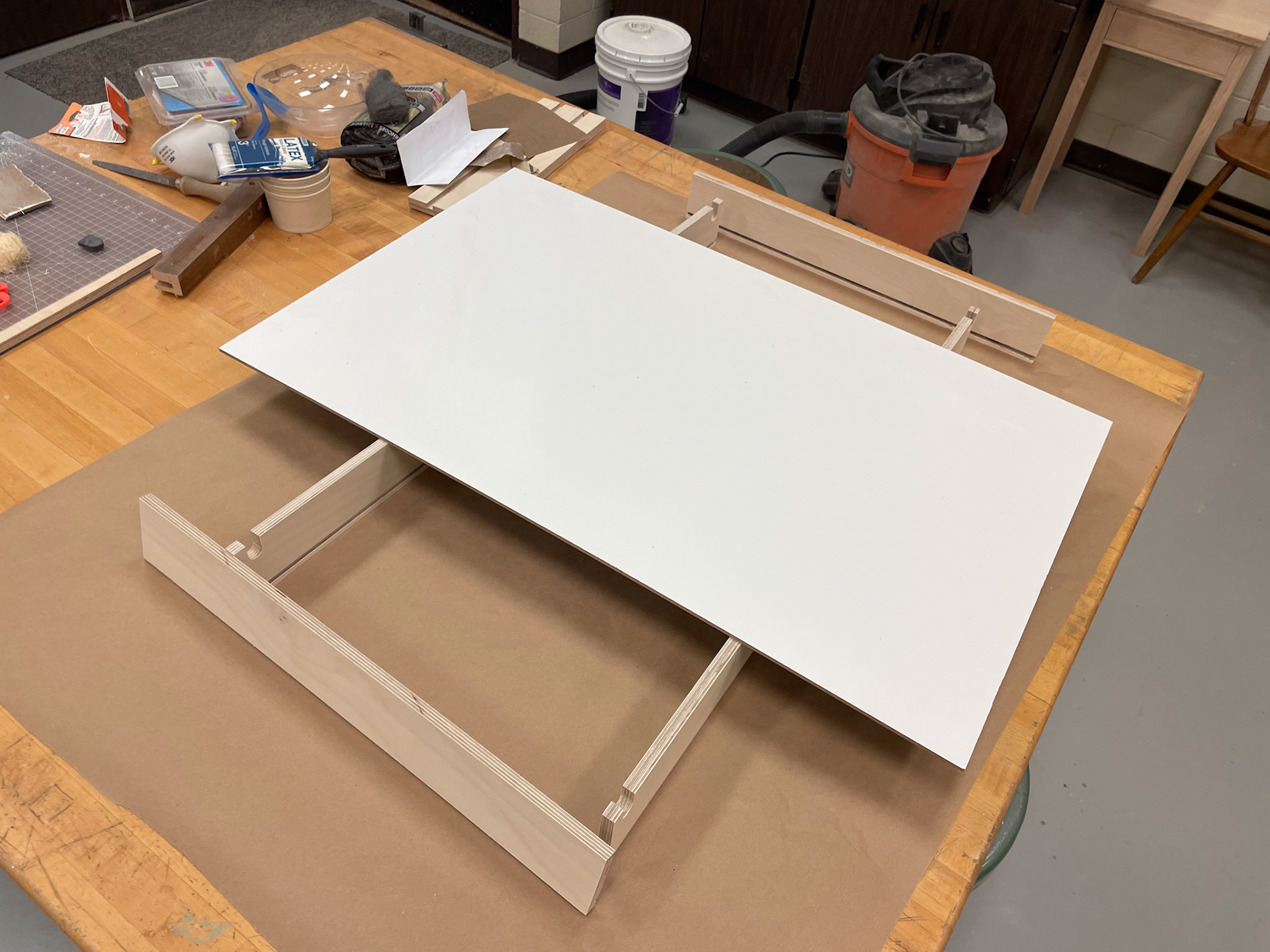
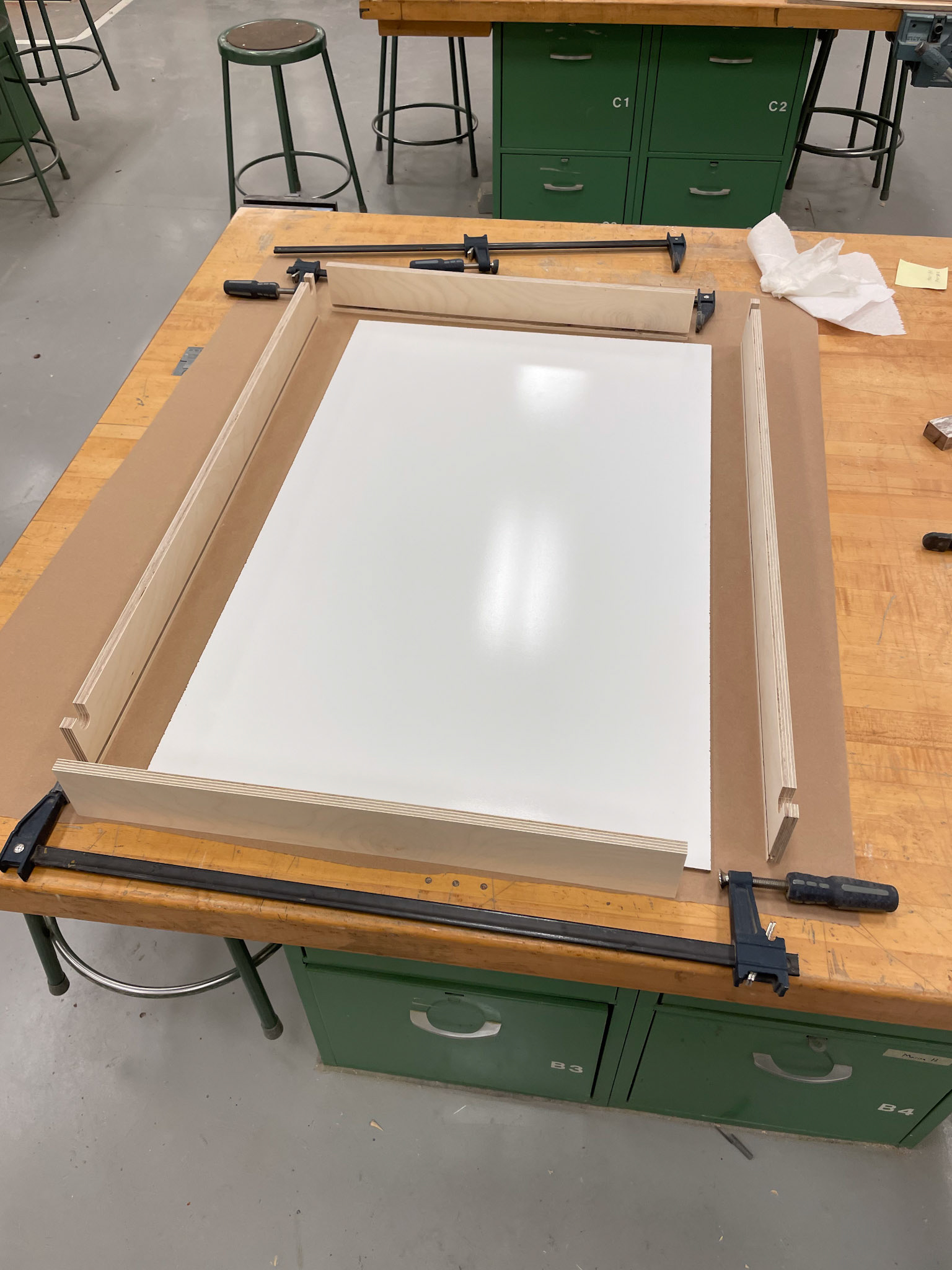
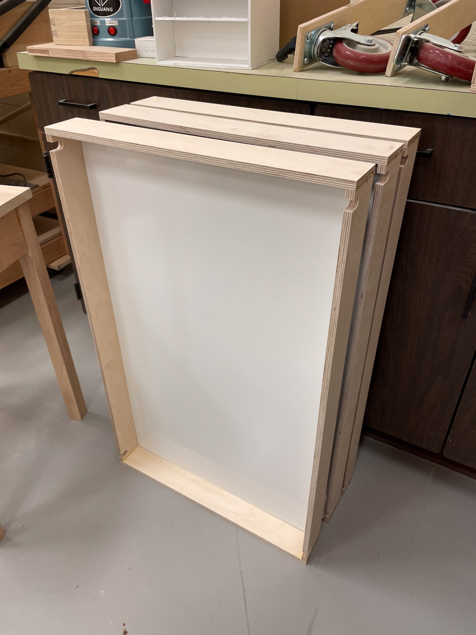
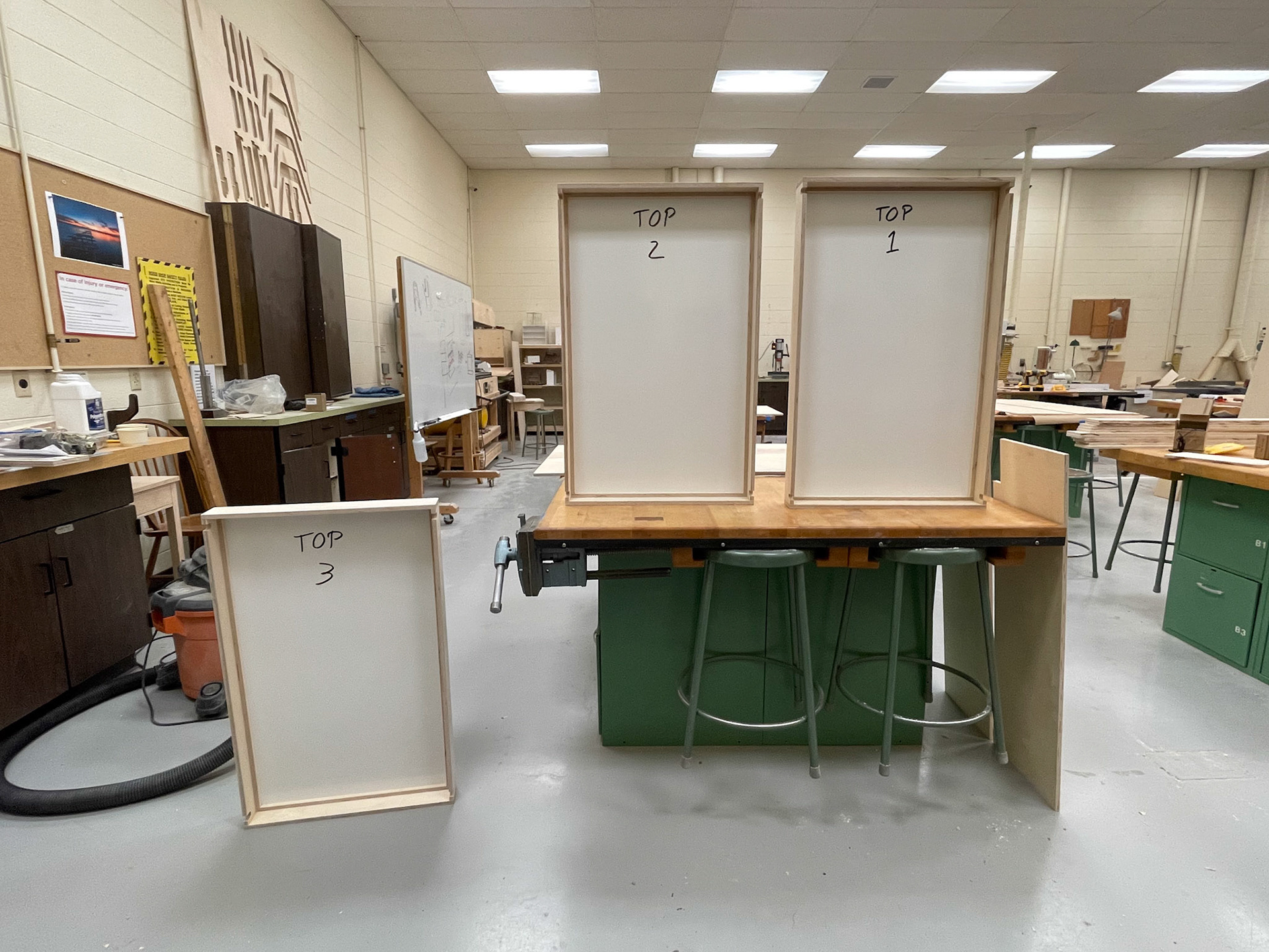
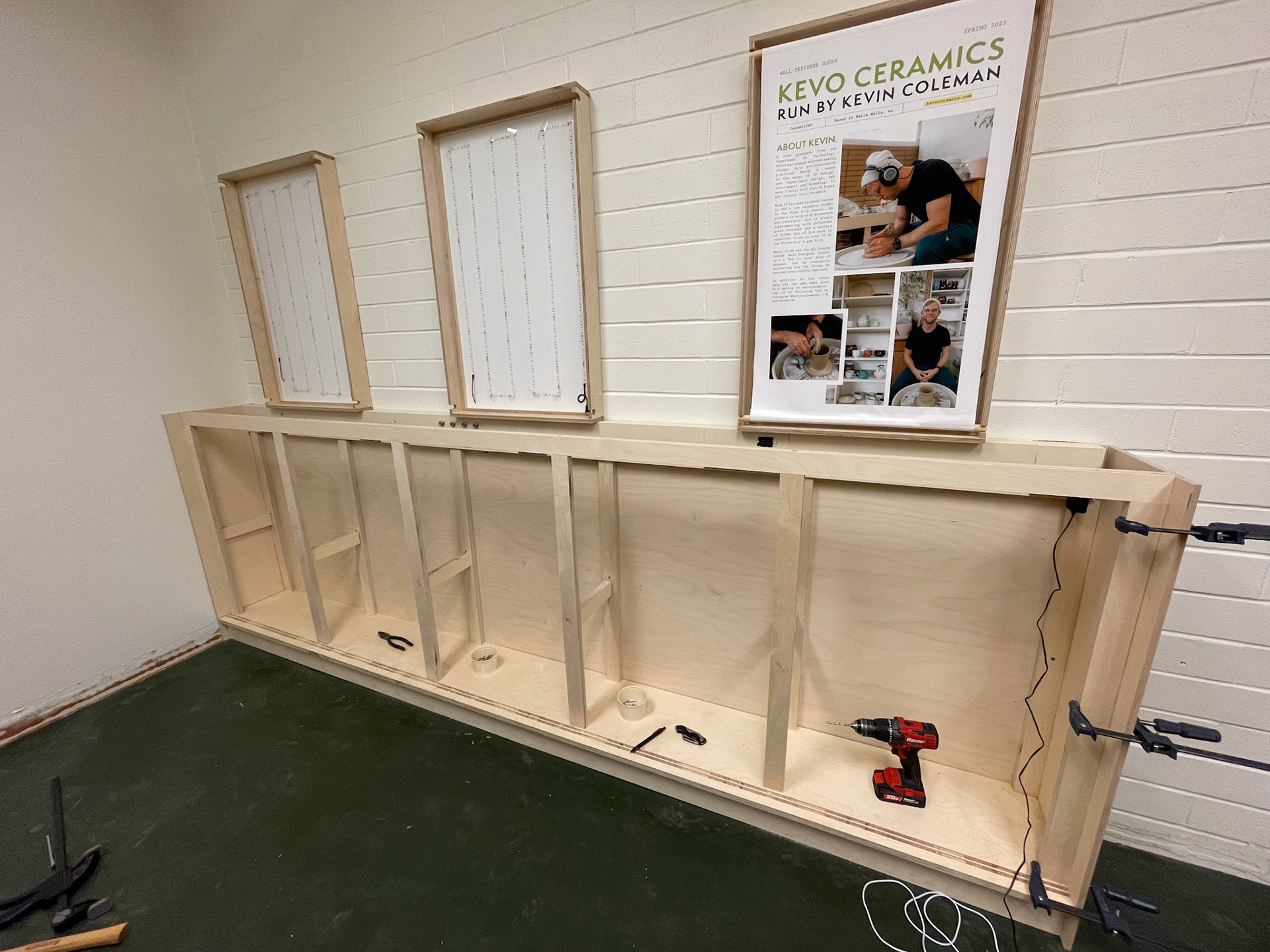
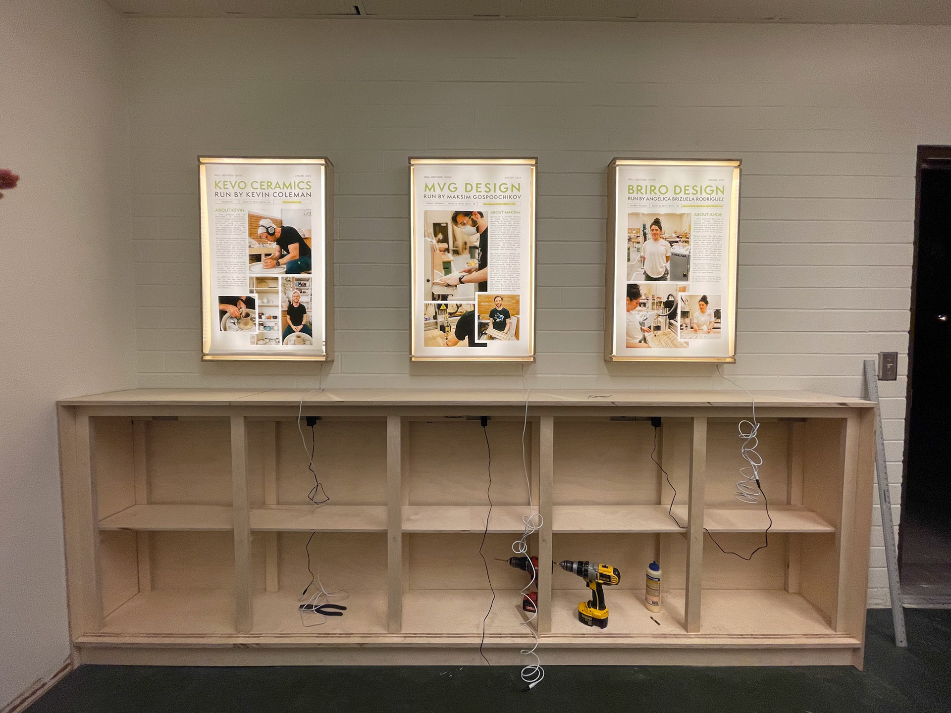
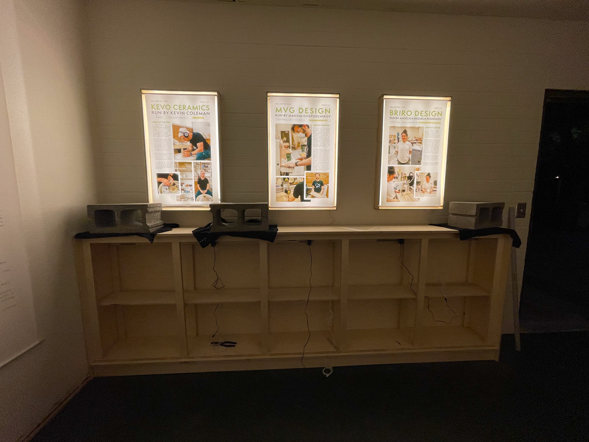
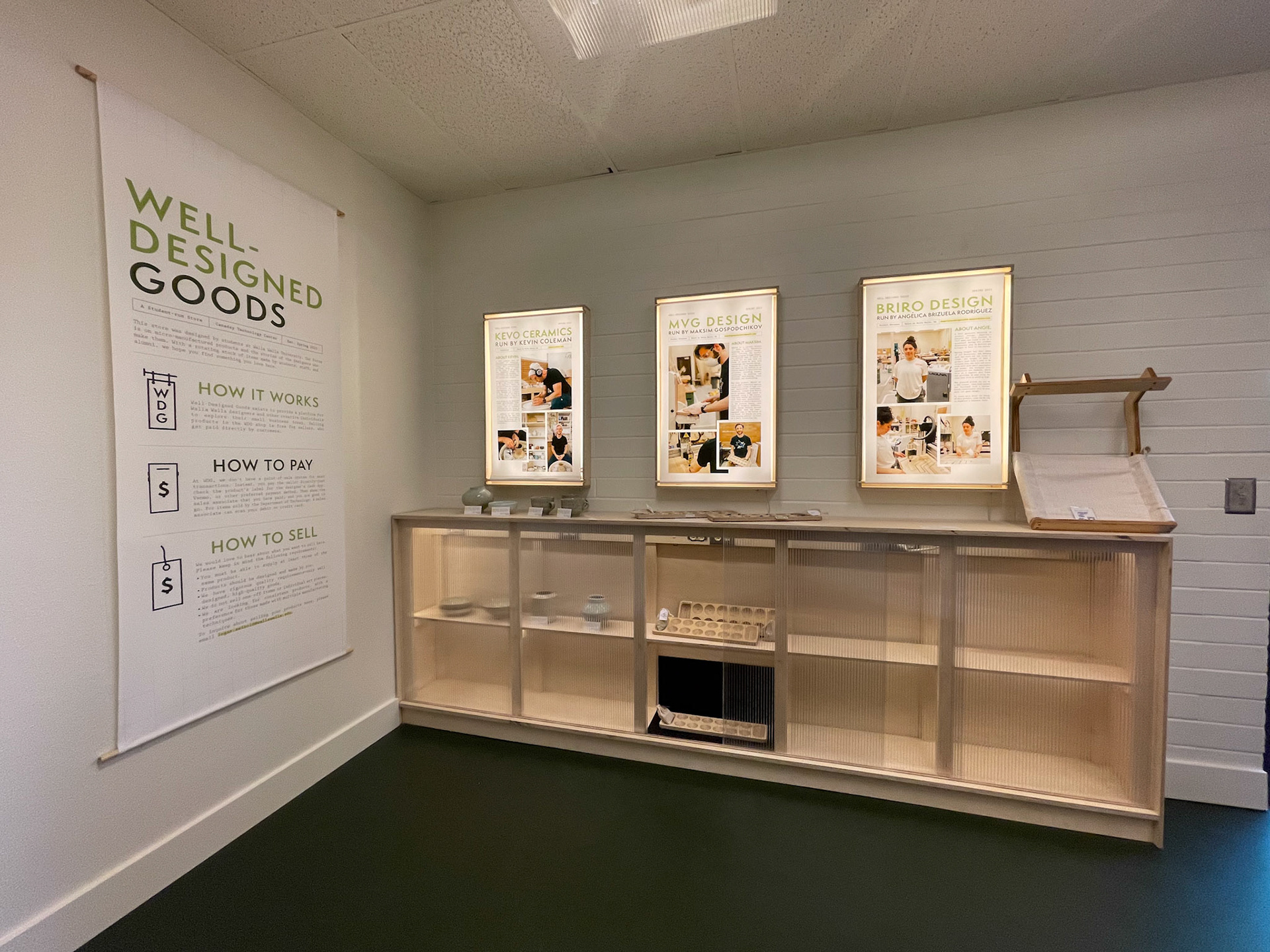
While we could still have others in the class help us, we were divided into smaller groups to focus on different aspects of the space. me and a partner were in charge of the featured designer displays and a cabinet piece to hold these designer's products. With a relatively straight forward concept, we decided to work on the display boxes first, with the expectation of having three complete by the deadline. An initial working model was built, which became the blueprint for the final concept. a groove would hold the back piece, with two side pieces featuring a hole for the scroll style poster. The idea was for the poster to have an equal gap on every side, allowing for back mounted leds to bounce off light. This would help provide accent lighting in the space. Our graphics team provided the posters with the correct margins, ensuring they would look like the initial concept. we were able to make all three boxes in time with the backlit element we had envisioned.




Continuation of renovation
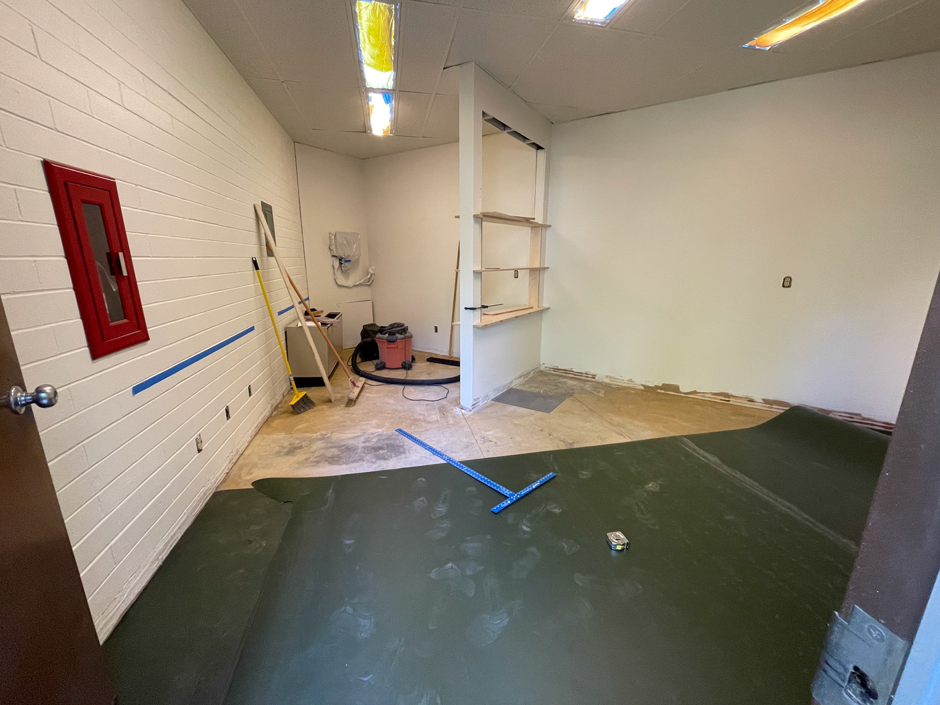
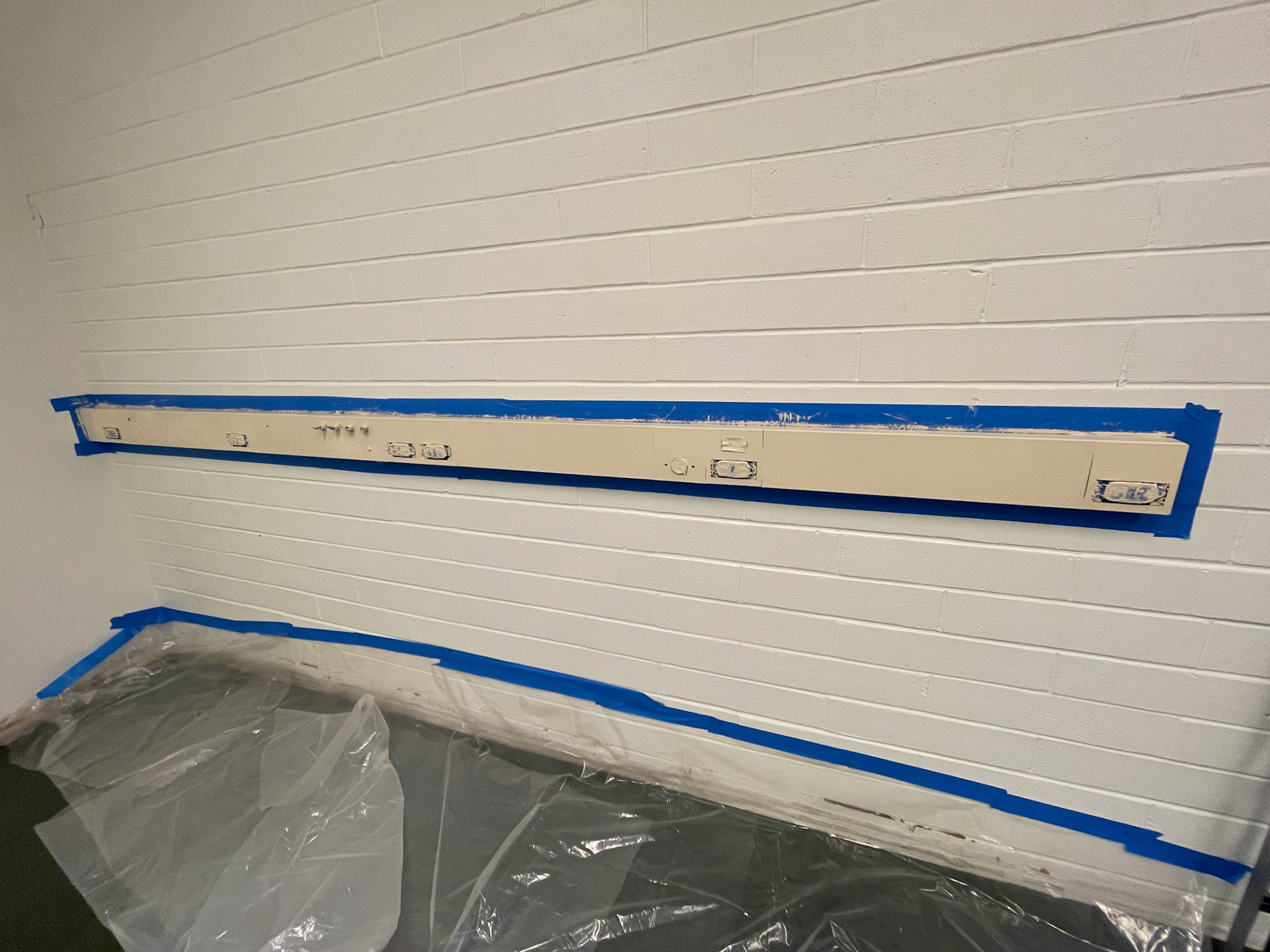
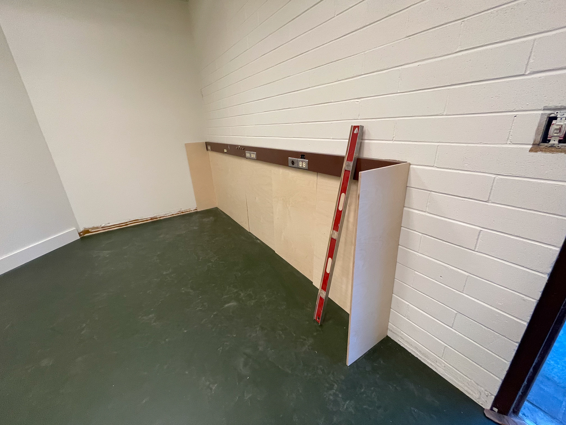
Within the actual space, the floor was fully removed, and the green floor that we initially pitched was purchased and applied. I painted the power strip to match the cabinet we would install, as the cabinet would be a built in and the strip would be visible from underneath.

Project 2 - large display cabinet
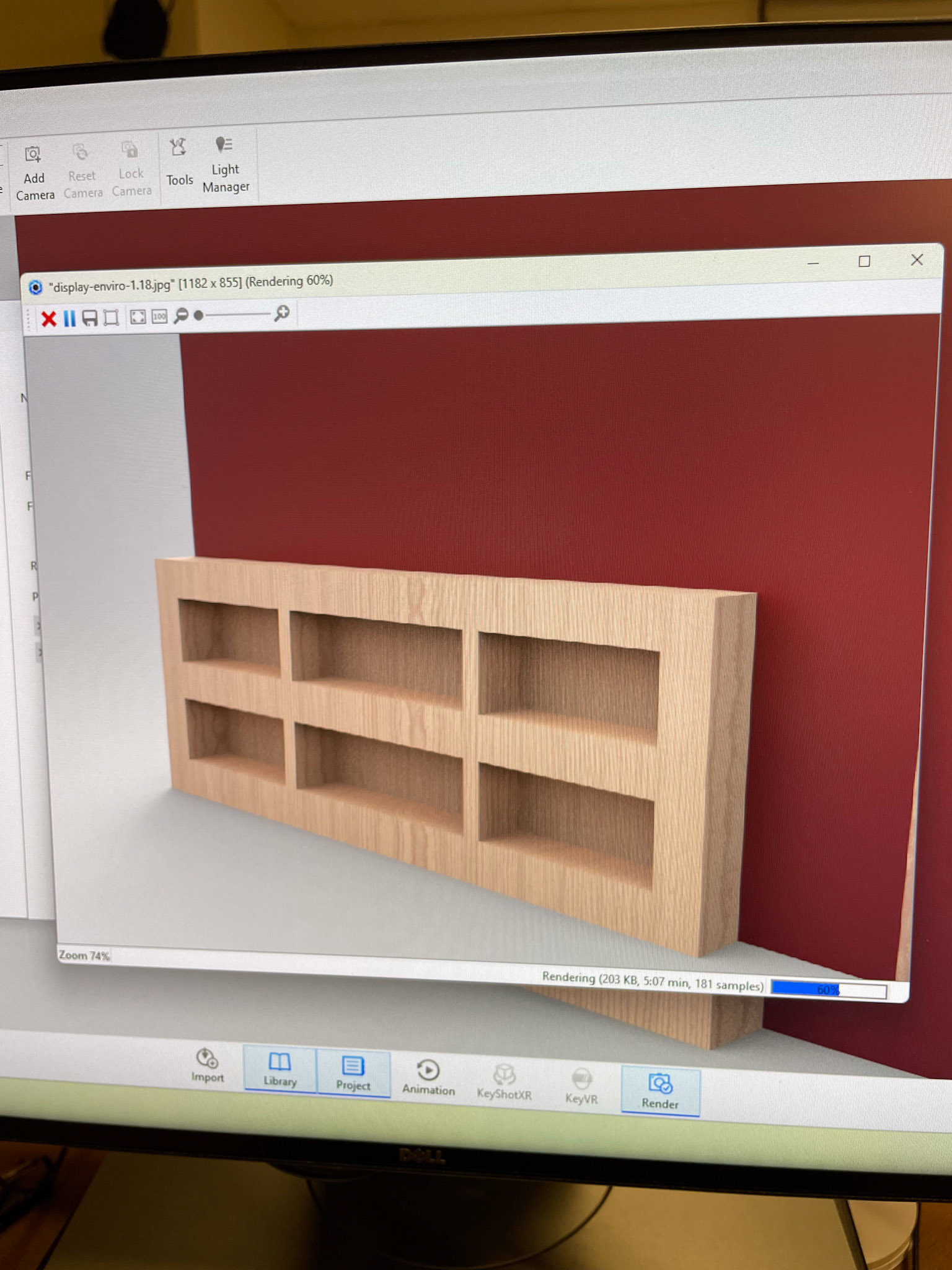
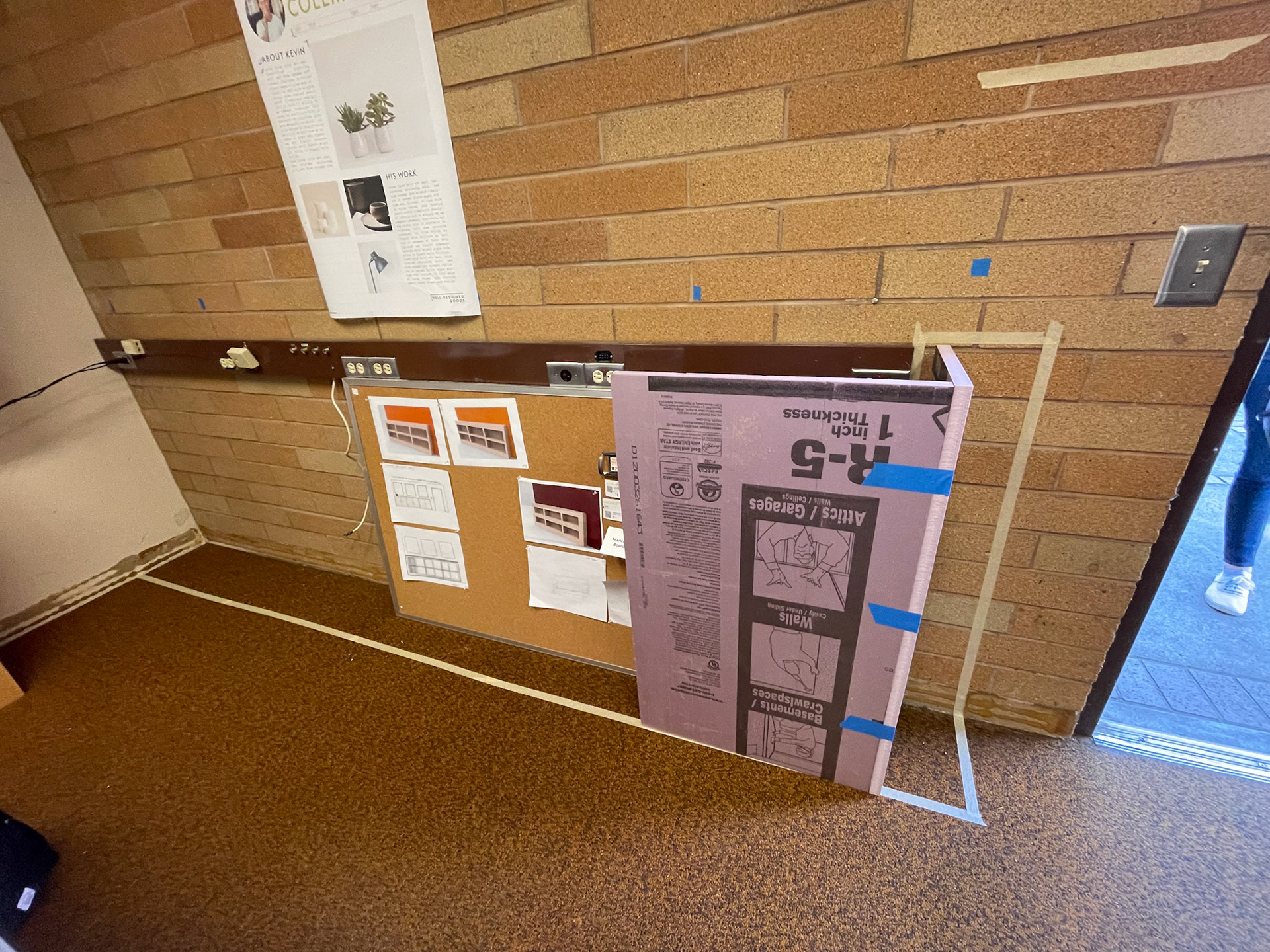
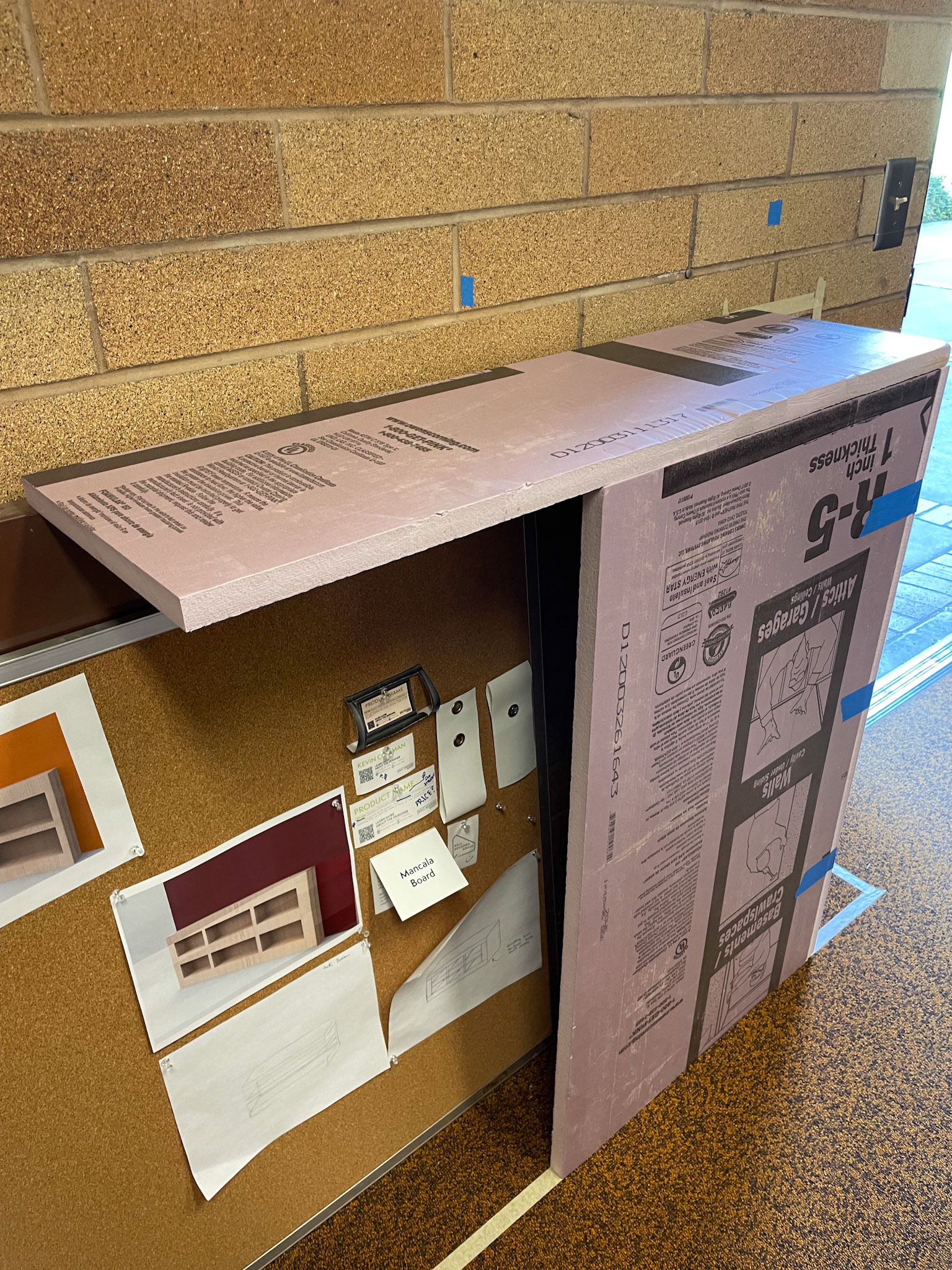
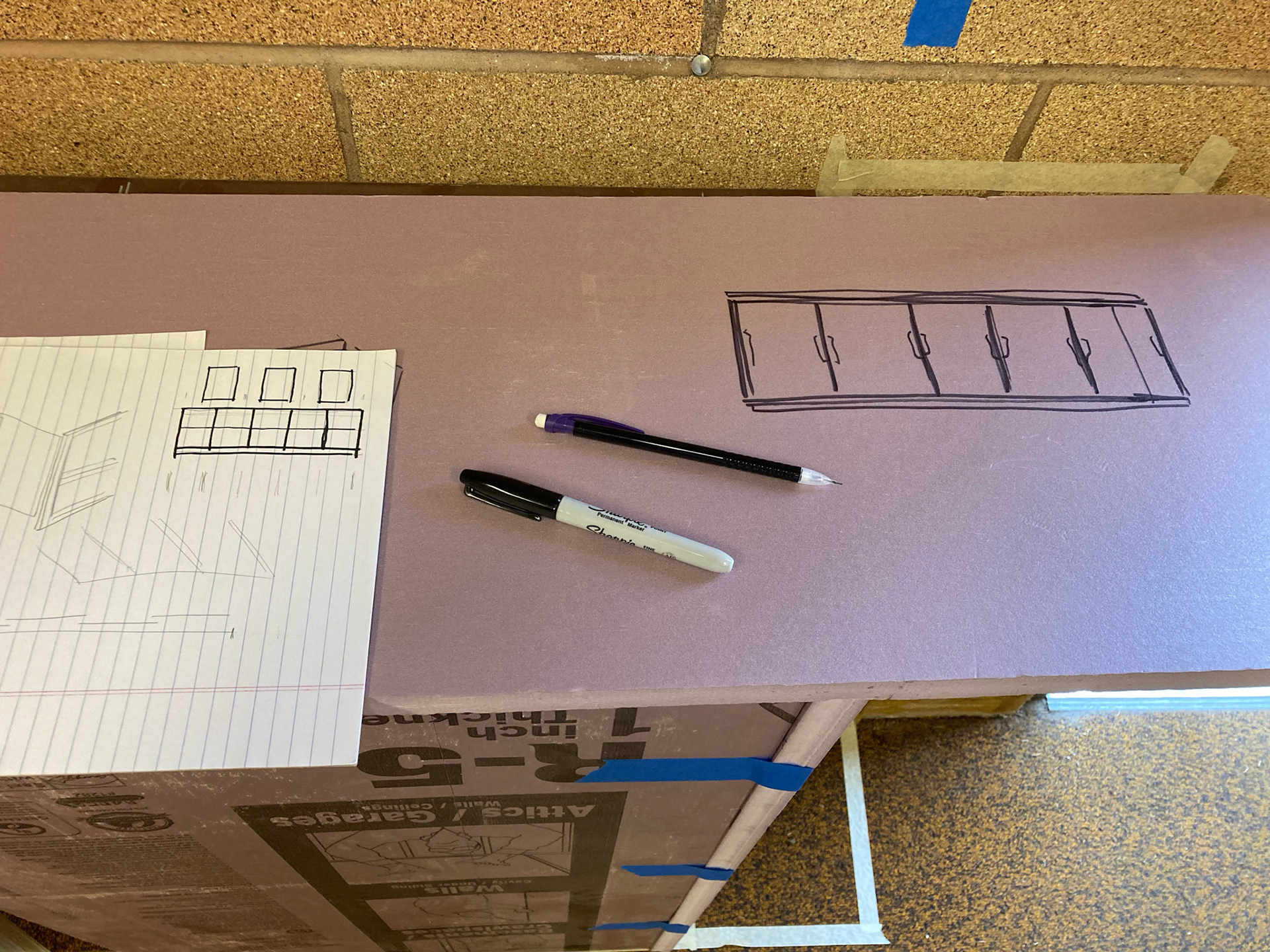
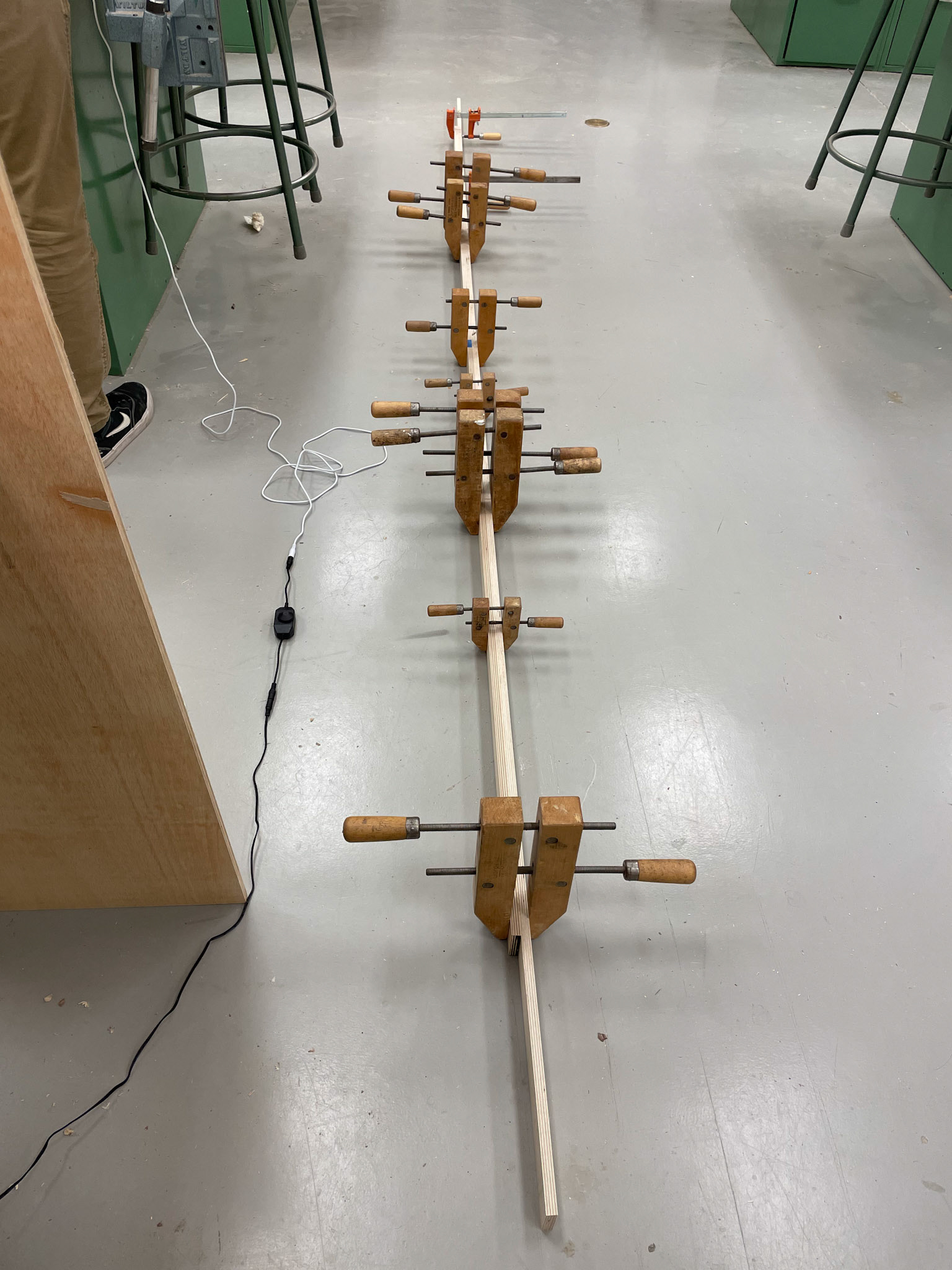
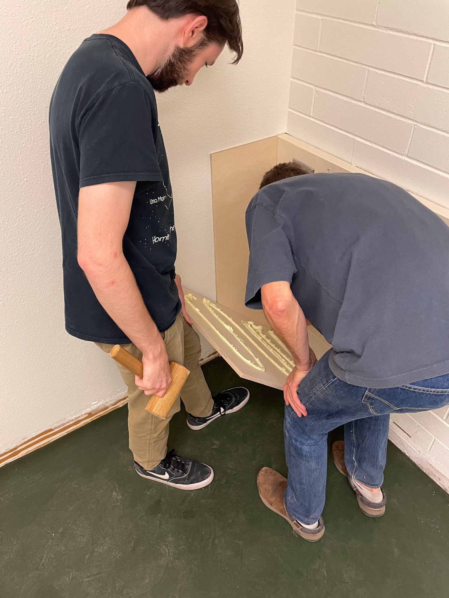
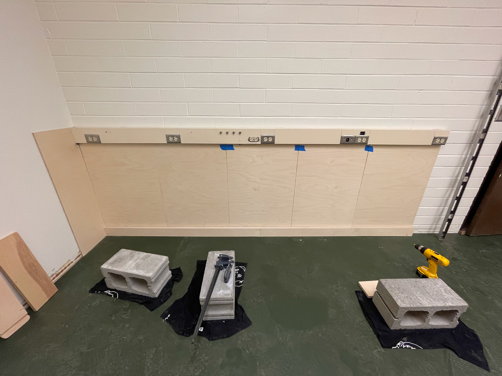
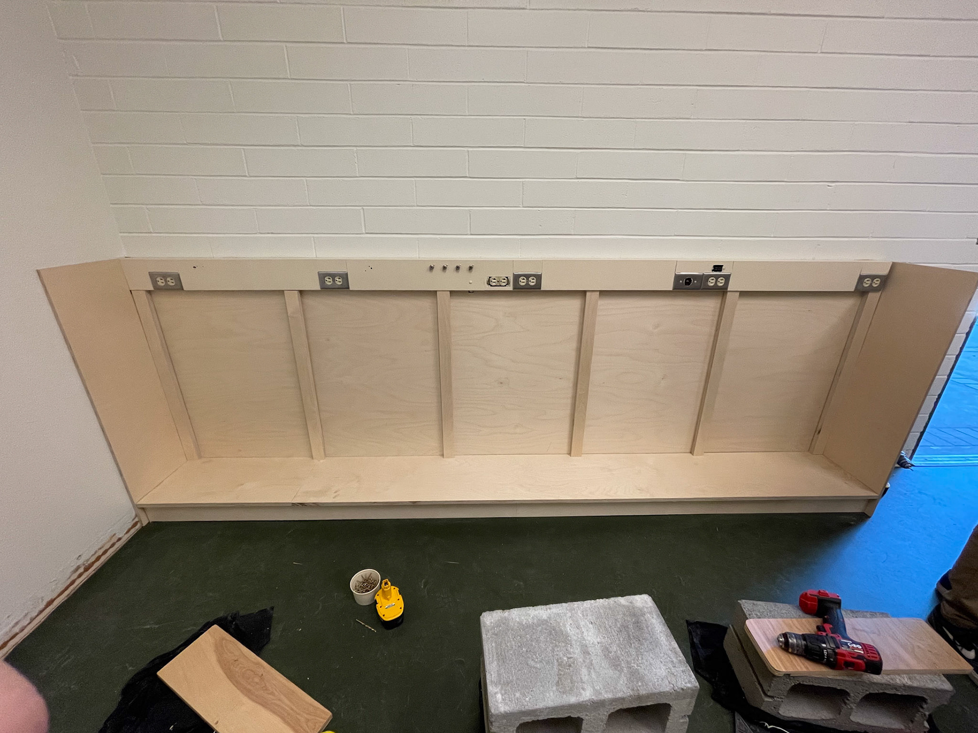
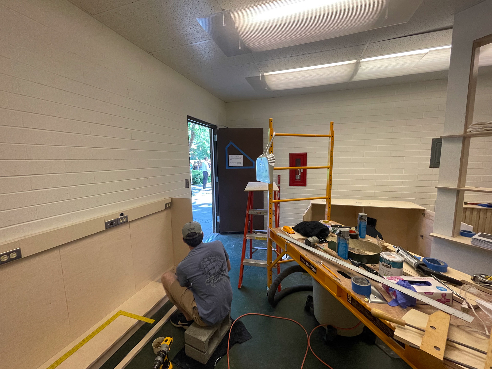
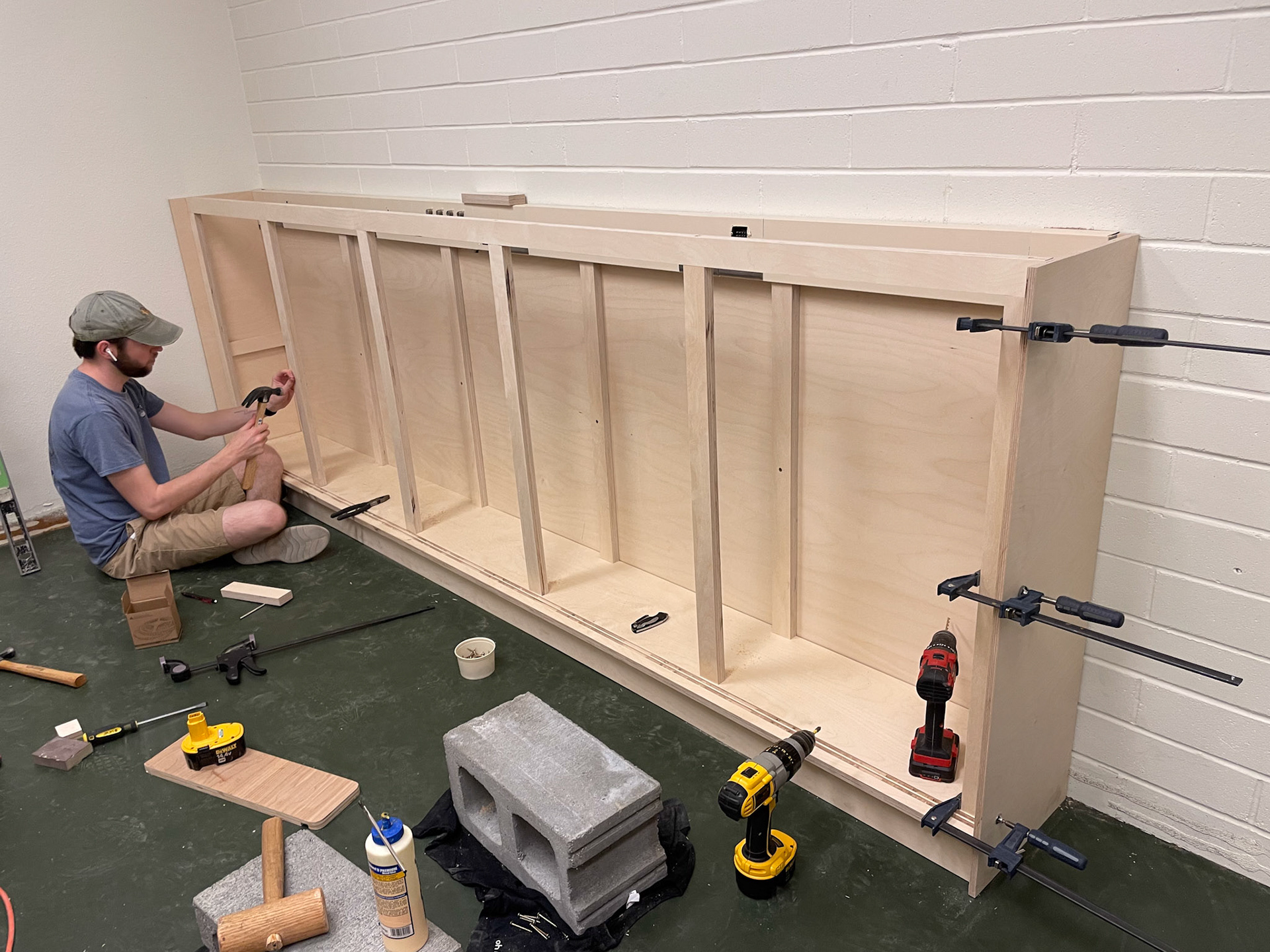
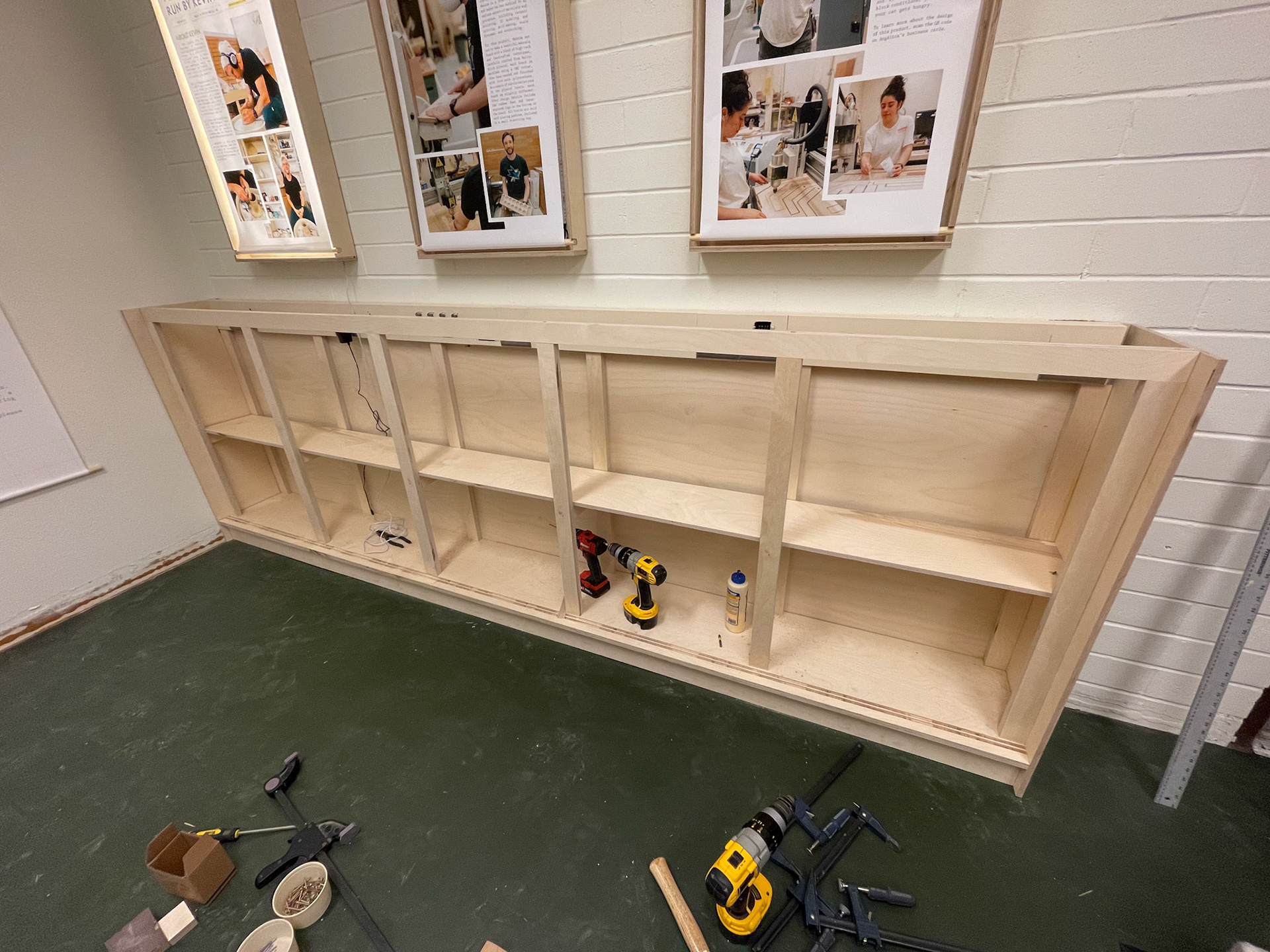
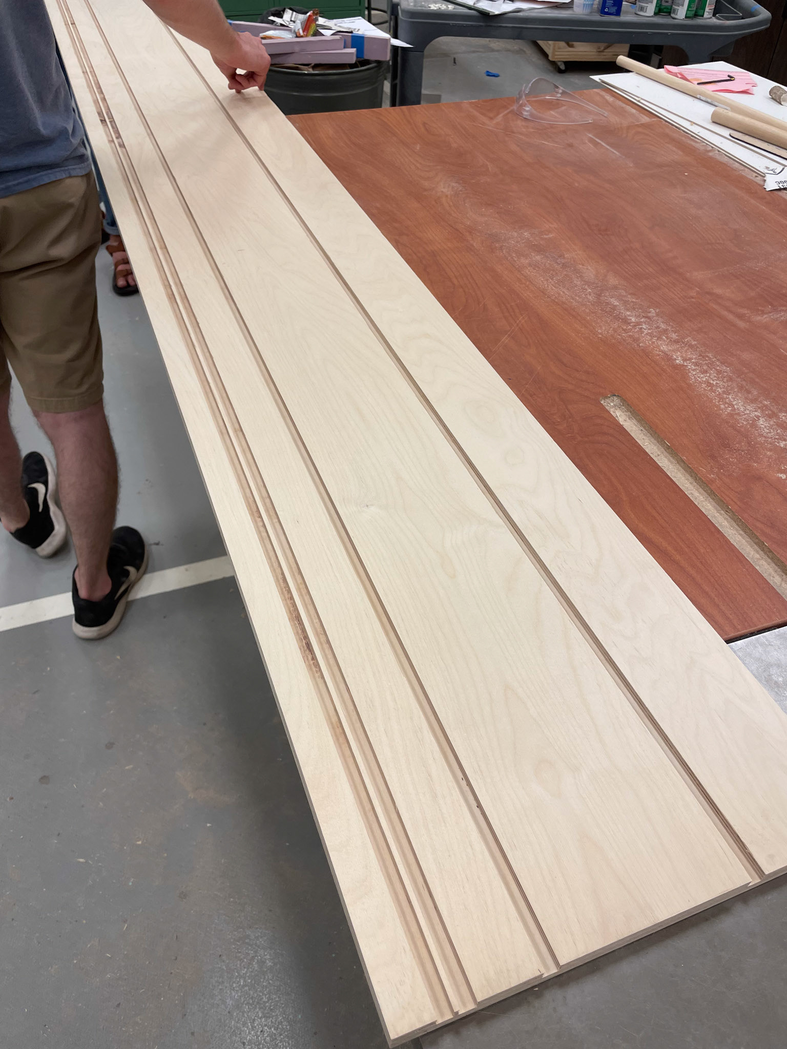
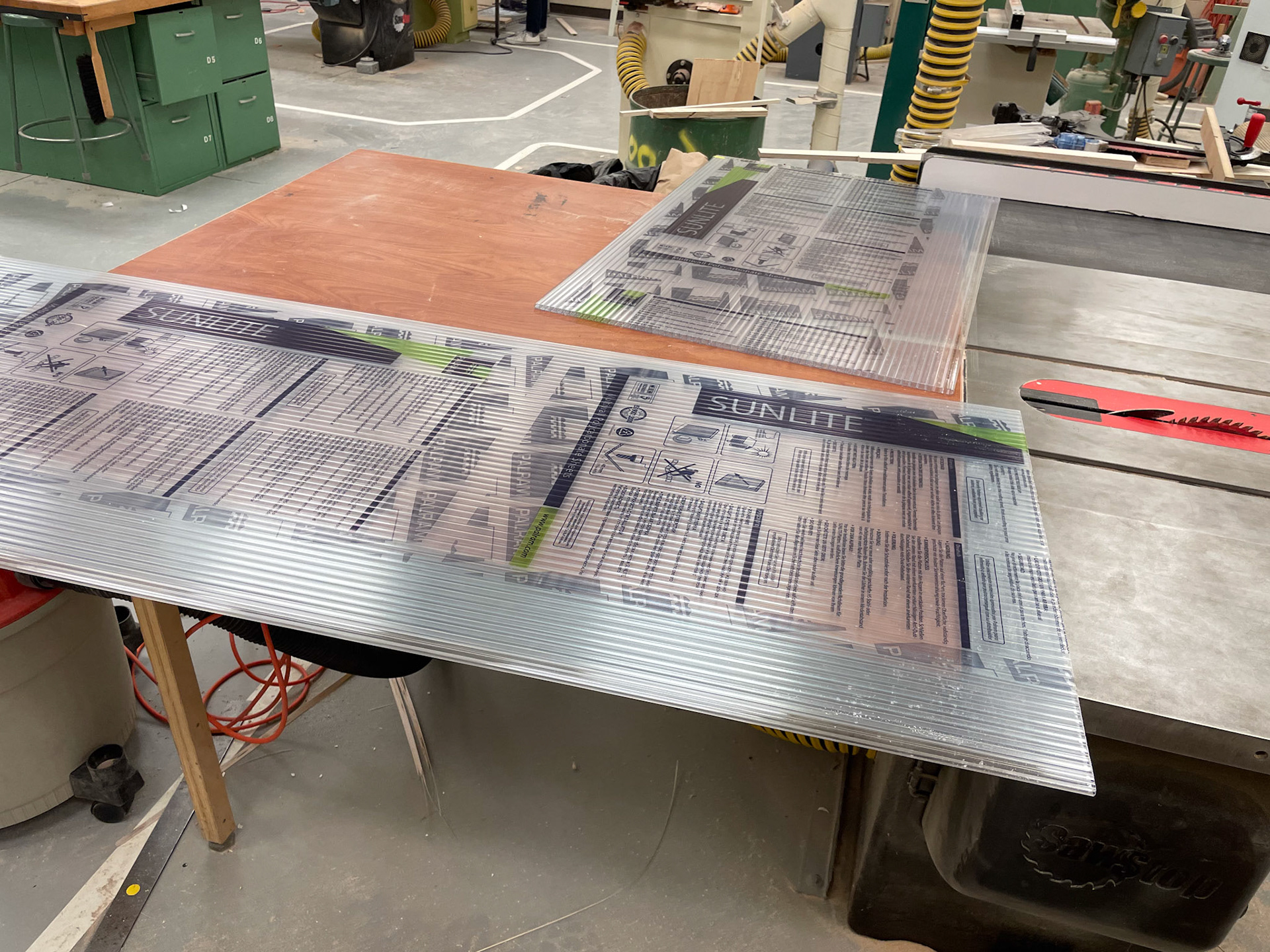
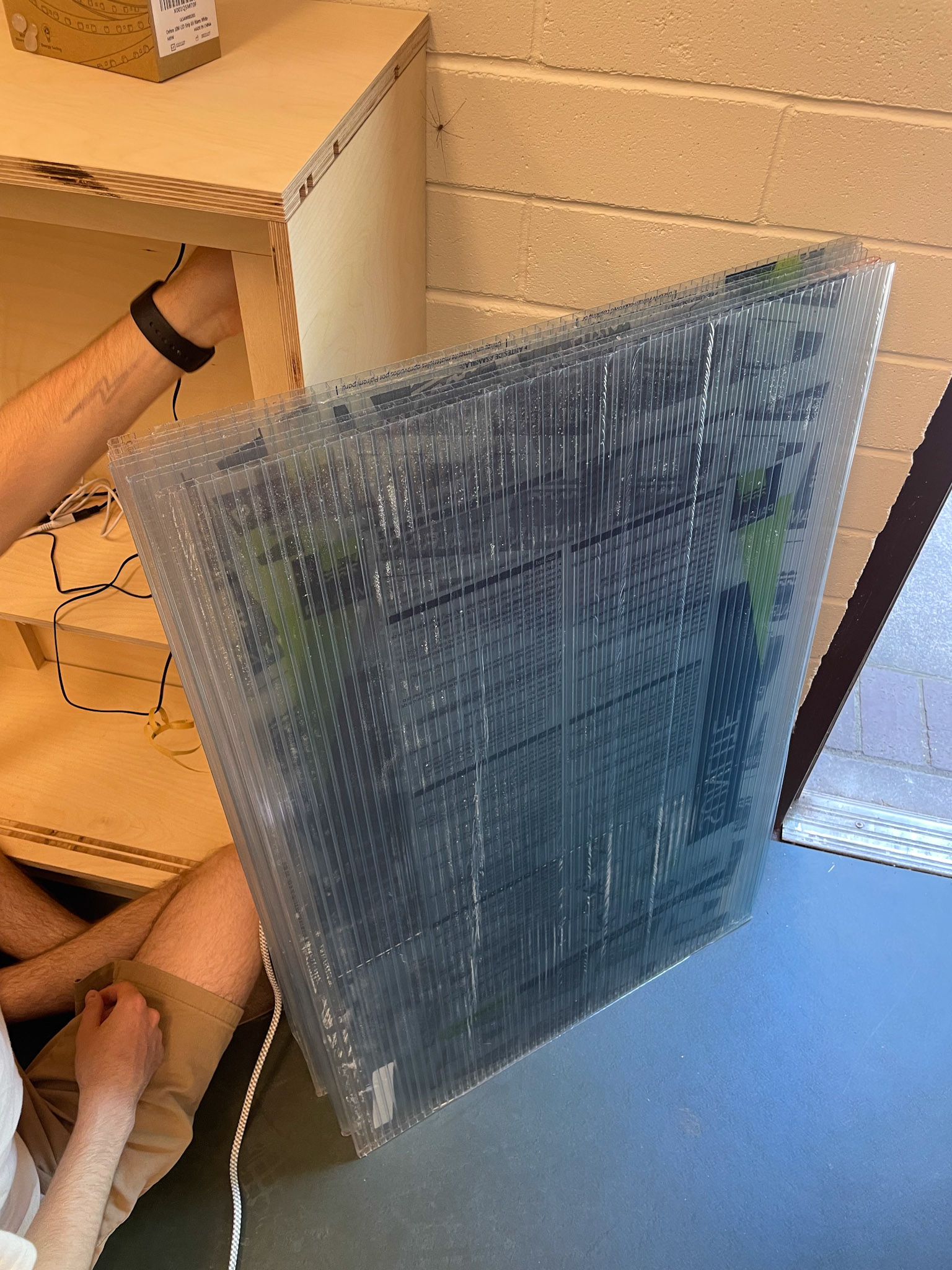
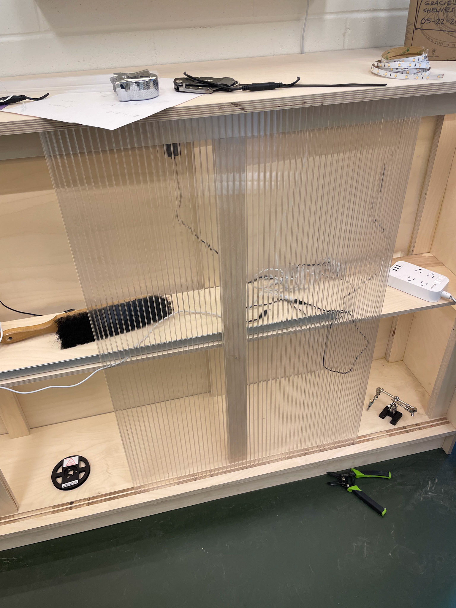
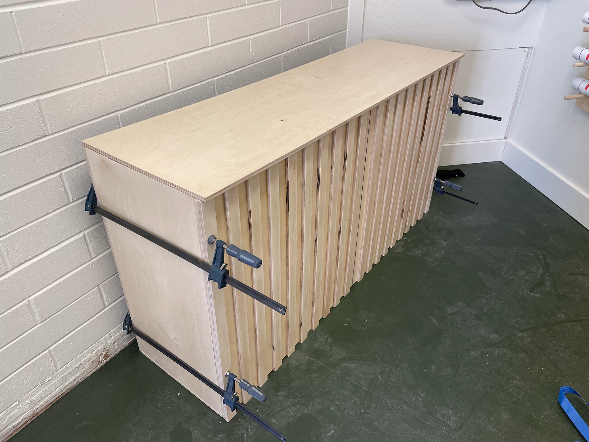
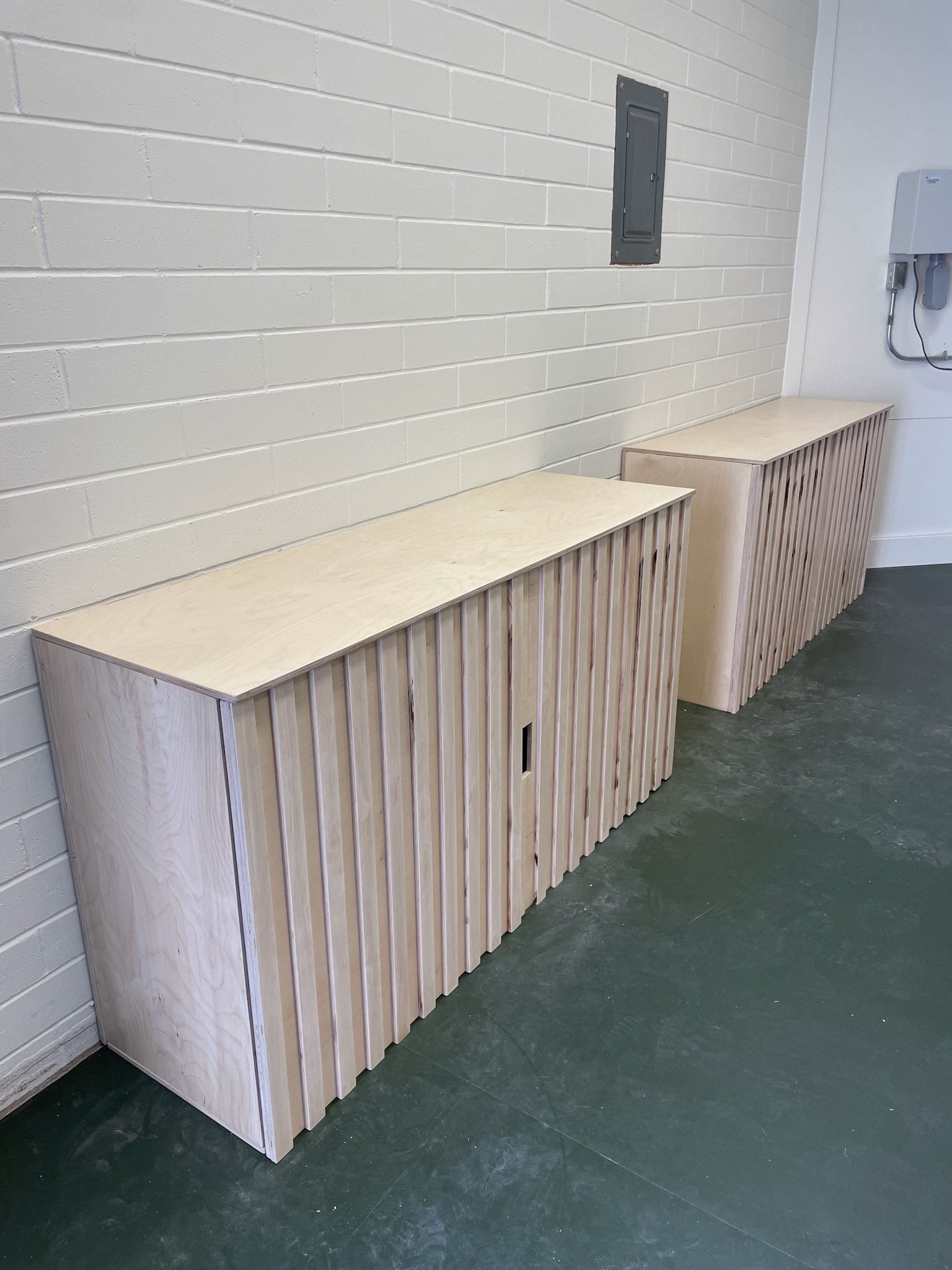
With the goal of mostly covering the built in powerstrip (roughly 10ft in length), me and my project partner thought about introducing a built in cabinet. my initial sketch's and renders were very simple and blocky. However, we opted for my partners option of a more segmented display cabinet with sliding doors. after further exploring the idea and getting approval, we could apply the backboards after the flooring was applied. to match the vertical slats of the other cabinets, we had vertical elements that were measured, cut, and applied to both the front and back. when it comes to the sliding doors, we chose a clear corrugated plastic and cut dadoes into the top and bottom pieces to fit the plastic's dimensions. After making the supports for the middle shelf, most of the pieces could be promptly attached. the top piece and middle shelf featured dadoes, allowing for an led strip to be applied and concealed. the doors fit and functioned as intended, the accent lighting provided good product spotlight, and the overall cabinet functioned perfectly.


Overall development
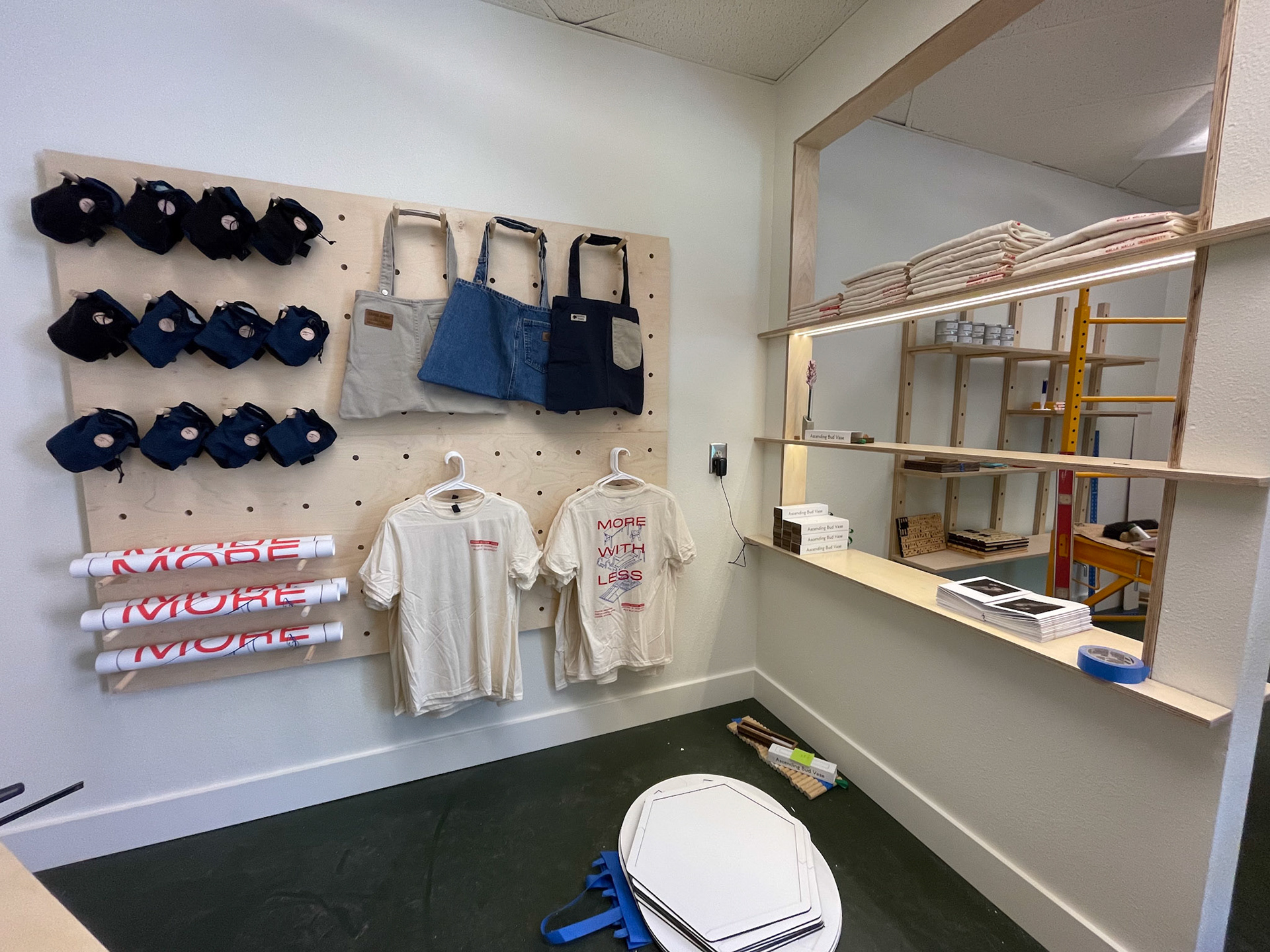
While I was working on the display wall, the other groups were developing the rest of the space. The other two cabinets turned out exactly as envisioned, solidifying the theme of vertical lines. A large cork board was created, allowing ample space to hang textiles via pegs. Floating shelves were introduced for both the other wall and the hole that had previously been created. more corrugated plastic was used, as it could diffuse the ceiling light once frosted. the graphics team provided price tags, wall posters, a door sign, and the featured designer posters. since these were large prints that were constantly being revised, final versions weren't applied till the night before opening.
Completion
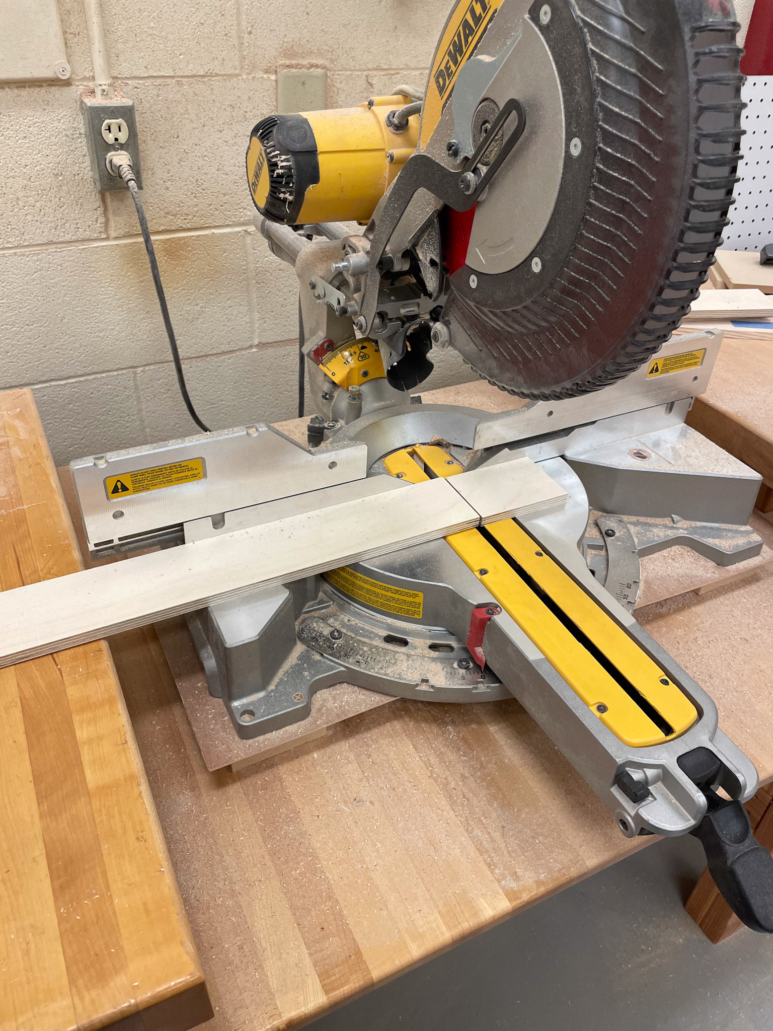
After ten weeks, we had fulfilled our prompt and created a store that was simple, neutral, and honest. While I would've liked to have more time dedicated to this project, I'm very impressed with what was presented. Creating a fully functional store in two months is no small feat, and if not for the full effort of the entire class, it would not be possible. the materials used consisted of mainly plywood, linoleum, corrugated plastic, led lighting, and miscellaneous hardware. The main programs used include Rhino, solidworks, adobe illustrator, and adobe indesign. We utilized the wood facilities in our technology building, mainly using the table saw and chop saw for larger structures and pieces. With a successful opening night, the hope is to showcase and promote local designers work for years to come.
